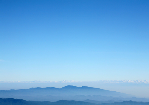
If you look up at a clear blue sky, you're likely to see a gradient. The sky is a hazy, whitish blue near the ground, and a deeper, royal blue as you look higher. These colors flow smoothly and gradually into each other, parallel to the horizon.
 The color of the sky goes from light blue to dark blue in a straight line parallel to the horizon. |
If you look at a picture of the sun (don't stare at the sun itself!), you see another kind of gradient. The sun is a bright circle, and the sky grows gradually darker around the sun as you look away. Instead of the colors changing in a parallel line, they radiate out from a center point.
 This time, the colors change gradually from white to blue as they radiate out from the sun. |
In a raster image editor, you can create your own custom gradients. These can be linear, like the gradient near a horizon, or radial, like the gradient coming out of the sun. Gradients blend two or more colors together, and can also use transparency values for other effects. Since our 3D sphere needs a background, let's use gradients to make one.
NARRATOR:
So we have our sphere and we have our shadow but we don’t have a background.
These pixels are transparent so we need to put something back there. Now we can always turn our old background layer and make the background white but that looks boring. I’d rather use a gradient. A gradient is a way to automatically and smoothly transition between two or more color values or opacity states. To find the gradient tool, it’s right here in the middle of the tool bar and it looks like a little gradient.
When you click on it, you see a preview of what your gradient will look like. This gradient is going to go from a pure black to a pure white, so if we tell the gradient to start here and click and drag straight down, what do you think is going to happen? We got a smooth transition from black all the way to white.
What do you think would happen if I started my line at the very bottom and drew straight up. That’s right. Now the black is on the bottom and it transitions smoothly up to white. How about if I start my line in the corner and I drag diagonally? That’s right, the bottom left corner is black, the upper right corner is white and we get a nice smooth transition in between. So not only does the direction of the line you draw matter, but the length and the position of the line you draw matters as well. If we draw a small, short line right here in the middle, the gradient is only going to stretch across the line we drew and the computer is going to fill everything below the line with white and everything above that line with black.
Now if we change our foreground color, let’s change it to a nice bright red. And let’s change the background color to maybe an orange. You see that our gradient changes. Now, instead of going from black to white, it’s going to go from red to orange. Next to the gradient preview we see the different types of gradients that are available. So this one we’ve been using is called a linear gradient. And this will draw the gradient perpendicular to the direction of the line that you draw. This one is called a radial gradient. And this will draw your gradient in a circle using the starting point of your line as the center and the end point as the outer limit of the circle. So for example, if we start in the middle of our image and we drag a line out past our sphere it gives us kind of a red glow to our object. If we begin our line up here in the left corner and we draw a tiny line facing this way, we’re going to get a red circle up there in the corner. If we start down here in the lower left and we draw a big line all the way across, now we see that this gradient, instead of going in a straight line across goes in a circle out like this. So these are fun to experiment with. Photoshop gives you a few different default options. There’s a spectrum, a rainbow, you can make a linear rainbow, there’s this one is called copper, that sort of looks metallic. There’s one that looks like chrome, like a reflection of the sky and a desert field. In addition, gradients also allow for transparency so to experiment with some transparency, let’s go ahead and delete this bottom background layer. We’re going to add a new layer, we’re going to drag it to the bottom and we’re going to call it background. Some of these presets have transparent stripes, so for example, we could draw a line this way. What do you think is going to happen? Are the stripes going to go up and down? Or left and right? If you said up and down, you are correct.
What if we….I’m going to undo that, control Z…What if we put this in a radial gradient? What do you think these alternating red and clear stripes are going to look like in a radial gradient? Let’s find out. It makes a target pattern. UNDO that. These presets are very flexible but you can also make your own custom gradients. All you have to do is click on the gradient preview and it will bring up the gradient editor. Now this one is a little complicated. Let’s go ahead and go back to our foreground and background.
And to edit the gradient, we are going to focus on this bar. On the bottom is where the colors are edited and on the top is where you’re going to edit the opacity. For example, if I click on this top stop here, and I bring the opacity down to zero, you see that it becomes transparent. This one is still 100%. If I bring this one down to zero, our gradient is completely transparent. Let’s bring this back up to 100. On the bottom is where you edit colors. So we could change this red to a blue. We could change this yellow to a green. We have a whole different gradient. You can also add different color stops and transparent stops. Simply by clicking above or below the gradient preview, so if we put one there, it adds an automatic yellow stop. You can change that to whatever color you want. If you add another one here, maybe make this one red, and now we’ve made our own custom gradient, just to see how that looks, let’s draw a quick line. That’s distracting. Let’s undo that.
And to give you an idea of how flexible gradients are, we’re going to recreate this sphere using just a couple of gradients. It’s not going to look exactly the same but you’ll get the idea. First we’re going to make a new layer. We’re going to name this one “gradient sphere” and we’re going to load our selection from before, called circle. Then we’re going to click on the gradient preview to bring up the editor and we’re going, let’s get rid of some of these stops. To get rid of a color stop, just grab it and drag it straight down. And let’s click on this color here and if we hover on any image, it’ll bring up the color picker so we can grab that highlight. We’re going to add a new color stop right about here and pick up the medium blue color and then we’re going to go to the last color stop and we’re going to pick up about the darkest blue we can find. Ok?
Remember we’re on a new layer here. Make sure we’re on the radial tool. We’re going to start our gradient right in the middle of this highlight and drag it down in the direction of the light and see? It sort of uses the same highlight and the same shadow effect. And to get the light bouncing off the ground effect, let’s look at our preset effects. We have one here that starts with a very light gray and then goes to a transparent. Let’s go ahead and edit that one, maybe make a nice light blue color. Press OK, and then to get that effect of the light bouncing off the ground we’re just going to draw another radial gradient towards the highlight and there we go. So again they’re not exactly the same but you get an idea of how you can use the radial gradient to create the image of depth just like we used the paintbrush tool.
