Up until now, our edits have been limited to one flat piece of digital "paper." But one of the things that makes raster image editing so powerful is the introduction of layers. You can think of layers as perfectly clear pieces of glass or plastic that you can stack on top of each other. You can change, rearrange, and blend layers together without affecting other parts of your image, and then flatten them into one final composite when you're done working.
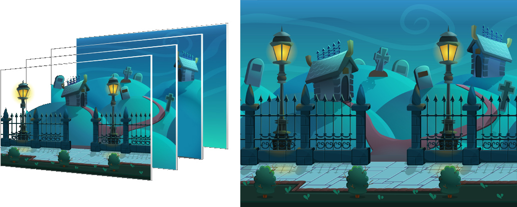 This illustration shows the theory behind layers. The background, middle elements, and foreground are all separate and stacked on top of each other when editing, but can combine together to create a final image. |
Layers also help introduce the concept of transparency. Pixels on a raster grid can not only show 16.7 million colors of light, they can also show 256 levels of transparency. Remember that the opposite of transparent is opaque, so a pixel that has 0 opacity is invisible, while one that has 100% opacity is fully visible. Like layers, transparency is incredibly useful to raster image editing. It lets you isolate certain elements, blend objects together, and simulate real world textures like clouds, glass, and reflections.
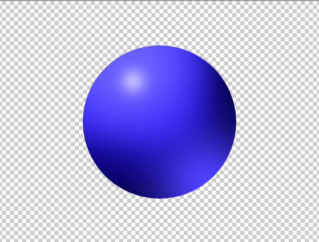 This sphere is 100% opaque (0%) transparent. We can't see the background through the object at all. |
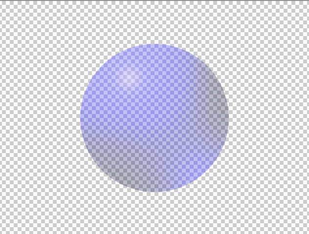 This sphere is 50% opaque (50%) transparent. We can see the background through the object. |
 This sphere is 0% opaque (100%) transparent. We can't see the object at all; we can only see the background. |
Another feature of raster editing that is difficult to do with traditional paint and canvas is transforming an object. Imagine you're drawing a picture of a dog with an old-fashioned pen and paper, and you accidentally make one eye too big. You would have to do a lot of work to fix just that one eye, or you might have to throw your drawing out and start over.
 That eye doesn't look right. If this were a traditional ink and paper drawing, this mistake would be hard to fix. |
Wouldn't it be nice to be able to select just the eye, transform it to the right size, and rescue your drawing? With the transform tool, that's exactly what you can do.
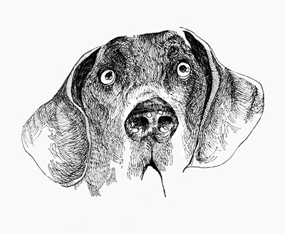 Using the transform tool, you can select just one part of an image and shrink it down back to normal. |
Let's see how we can use layers, transparency and transform tools to add a convincing shadow to our 3D sphere.
NARRATOR:
So here we have our sphere and it has a 3D look to it but next we want to add a shadow to the ground. And as we have covered before, you can only edit the pixels that are selected. Well if we want to draw the shadow outside of the selection, that’s not going to work. We’re going to UNDO that, control Z or command Z on a mac, and even if we drop the selection, SELECT – DESELECT and we try to draw a shadow, well that doesn’t look right either. The shadow appears in front of the sphere and that doesn’t look natural at all. Let’s undo that as well. Let’s bring our selection back LOAD SELECTION – CIRCLE – OK. So what we need to do is we need to use LAYERS.
And you can think of layers as kind of like imaginary clear glass sheets that you can stack up on top of your background image and edit them independently, blend them together, move them around and they’re not going to really affect each other unless you want them to.
So they’re incredibly useful, they’re incredibly flexible. Chances are every project you work on in raster image editing from here on out, you will use layers. So let’s get into it.
Now that we have our sphere selected, we’re going to go to EDIT, COPY and copy that to the clipboard. And then we’re going to make a new layer. Now if you don’t see the layers window, go to WINDOW and select LAYERS, make sure there’s a checkbox next to LAYERS or you can just tap F7.
And to make a new layer we want to click on this icon down here, it looks like a piece of paper with a corner turned up. Click on that and it will make a new layer. And the first thing I like to do to keep everything organized is to rename my layers. Because I have seen images with dozens and dozens of layers and if they’re all named layer 1, layer 50, layer 22, it’s very hard to keep track of what they are and what they should be doing. So we’re going to double click the name layer 1 and we’re going to just rename it to “sphere.” Press ENTER to accept that change. And now all we have to do is to go EDIT – PASTE. And it doesn’t look like very much has changed but if you look in this small preview window here, in this thumbnail, you’ll see that there’s something now in that layer. You can see these two eyeballs in the left hand side. So it makes sense if you want to not see a layer, but you don’t want to delete it, just close the eye. Let’s close the background eye and see what we’ve got in our sphere layer.
Ok, so now only our sphere layer is showing. We can see that we have our sphere against a transparent background. So there are no pixels occupying any of the space in this transparent area. This checkerboard background texture just means that it’s transparent. And if you zoom in really close, you can see that we’ve got some solid pixels, some pixels that are kind of transparent and then it goes to completely transparent. 100% clear or zero % opaque. We can take advantage of this transparency to create a shadow that is opaque in the middle and then spreads off to transparency around the edges just like shadows in real life do.
So we’re going to go ahead and make a new layer again, click on this icon, and we’re going to rename this one “shadow. “ And to make our shadow shape, we’re going to just use a simple technique; we’re going to just use the paintbrush tool we’ve already encountered. We’re going to make sure that the foreground color is black. So we want to bring up the color picker and bring it down to the lower left corner, make sure all the values stay zero, red is zero, green is zero and blue is zero. Hit OK. And we’re going to adjust the size and hardness of our brush shape. Let’s try 200 pixels for the radius, its size. And we’re just going to make the hardness a little bit higher. I want a little bit of a sharper edge on this shadow, we’re going to bring it up to 15%: Ok, looks good, so what we need to do is we’re going to click this anywhere and it sort of looks like an eye right now. But that’s not the effect we want. We want to move this shadow to the ground and there is a tool for that – it’s called the MOVE tool. It’s at the very top of your tool bar and we can move this down and now that’s about where we want the shadow to be but that doesn’t look very convincing at all.
We need to do a little bit more work. What we need to do is we need to make this shadow shape appear like it is on the ground, like it’s flat on the ground. And to do this we need to transform it. Make sure your shadow layer is selected and then go to EDIT – FREE TRANSFORM or Control T, Command T on a Mac. And this will bring up a bounding box. Now the box has eight anchors, one on each corner and one on each side. And manipulating these anchors will allow you to transform the shape in many different ways. You can grab a corner and shrink it. You can enlarge it. You can rotate it. You can, even if you hold down certain keys you can manipulate it in different ways. Right now I am holding down SHIFT and CONTROL (would be SHIFT COMMAND on a Macintosh) and it allows you to free transform each of these edges. This is ALT SHIFT while I’m dragging (which would be OPTION SHIFT on a Macintosh). So you can experiment with these. I’m going to hit ESC to not commit to any of those changes. I’m going to press CONTROL T again to bring up the transform box and this time I’m going to hold down ALT and SHIFT while I drag the top and what that’s going to bring in the top and bottom at the same time to kind of squish this shadow shape down. So click and hold and ALT SHIFT (option shift on a Macintosh) and bring it in until it looks nice and realistic. I think we can make it a little bigger. So again I am going to click on the side anchor, I’m going to click and hold, ALT and SHIFT and bring out the sides of the shadow shape. I am going to press enter to commit to those changes. You can also press this checkmark up here. And this is looking a little weird because the shadow is covering the front of the sphere. So like I said before you can rearrange these layers however you like. We’re going to grab the shadow layer, we’re going to click and drag and we’re going to move it down behind the sphere. And now that is starting to look like a more convincing shadow.
And since the light is coming in from this direction, right now the shadow is directly beneath the sphere. It doesn’t look quite right. So, I think we can move the shadow over about 10 pixels and that looks pretty convincing. We can also lower the opacity of our shadow. So, right now it’s at 100% opaque, remember 0% opacity is invisible, 100% opacity is completely visible. We move it down to about 90% opacity it looks a little bit more convincing.
Ok, so that’s looking pretty good. We’re going to save our work, FILE – SAVE. And next we’re going to add a background using gradients.
