While all the colors we see in raster images can be broken down into different variations of red, green and blue, there are lots of other ways to categorize and manipulate color values. For print media, artists often turn RGB (Red, Green and Blue) color spaces into CMYK (Cyan, Magenta, Yellow and blacK), which works better for ink and pigment. The L.a.b. color space can produce more colors that the human eye can see, and is great for storing large amounts of information. But for fast, predictable color adjusting, you can't beat Hue, Saturation, and Brightness, or HSB ("brightness" is sometimes also called "lightness").
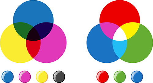 The three circles on the left show the CMYK color space, which is used for print media. The three circles on the right show the RGB color mode, which is used for digital displays like the screen you're looking at now. |
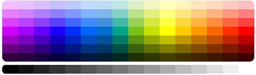 The color swatches in the middle of the rectangle show hue, which is the shade of a color (like red, orange, or yellow). The colors get less saturated as you go up or down from the center. The horizontal strip on the bottom shows brightness levels from black to white. |
Using hue, saturation, and brightness, we can take the flower we selected and make it really stand out. But color alone often isn't enough to lead your viewer's eye to the subject of your image. It also helps to thoughtfully crop your image. Cropping lets you change the frame of your picture, getting rid of unnecessary parts and allowing for creative and interesting focal points.
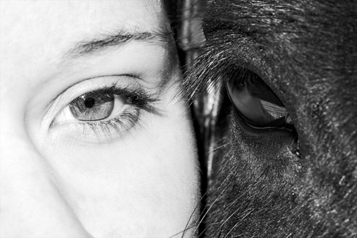 This photographer chose to crop in close on the eyes of the horse and the woman, creating a compelling image. |
Open your layered flower image from the previous step, and follow along with this tutorial to see how using color and cropping can bring out your subjects.
![]()
NARRATOR:
So here’s our flower image from the last step and we have a pretty good selection of the flower separated from its background, but we haven’t really done anything with it yet.
So were going to try to make this subject sort of pop, we’re going to make the flower sort of stand out from the background using hue, saturation and brightness. One kind of visual way to see what hue, saturation and brightness does is to just open up the color picker. By default, the color picker is set on H which stands for hue. And as you can see, this column right here in the middle, has every hue or every color in the rainbow. So hue is basically where the color falls on the color spectrum.
The hue of this color is yellow. The hue of this color is a dark blue. The hue of this color is magenta. So whatever name you give a color, that’s its hue.
S is saturation. A saturated color is bright. It’s vibrant. It’s kind of juicy. That’s a highly saturated color.
A de-saturated color is gray. It’s kind of dull. It’s a little bit muddy. So here we have kind of a desaturated red. We can make it a fully saturated red by moving this slider all the way up and moving the picker up to the right.
B is for brightness. So when you click on this, predict what you think is going to happen to this middle column. What is this column going to look like when we click on brightness? Let’s find out. So now this has become a brightness slider. At the very top is the brightest color, the brightest red you can have. Here at the bottom it’s completely black. Zero, zero, zero, black.
So H – Hue. S – Saturation. B – Brightness.
Let’s see how this works with our image. First thing I want to do is I want to select the flower layer. We’re going to go image, adjustments, hue/saturation, which is also control U or command U on a Mac. And here we have our three sliders again, hue, saturation and lightness. I want to change the color of this flower to something besides this nice pink that we have. So if we grab the hue slider here and we start moving it around, you’ll notice that the flower begins to change colors. What the program is doing it’s just shifting all of those values so in the middle it starts off as its original magenta color and as we slide the slider around, it’s just shifting all of the values of the hue without adjusting its saturation or its lightness or brightness.
So let’s pick a, maybe kind of a cool blue here and we could look at the saturation. Remember, if we move our saturation all the way to the bottom, our flower is going to turn black and white. If we move it all the way to the top it becomes a very, very bright, vibrant blue. Let’s boost the saturation a little bit just to kind of make it pop a little bit more. Just for an example, we’re not going to commit to this change, but just for an example, what do you think would happen if we move the lightness slider all the way to the left? Towards the black? If I move it all the way to the left, what do you think would happen? Ok if you said the flower would turn completely black, you were right. And if I move it to the right? Correct. The flower would turn completely white. Let’s put it back in the center. We’re going to hit OK.
Now that flower pops a lot more than before, but to give it even more of an effect, we’re going to go ahead and select the background layer. We’re going to go again to image / adjustments / hue/saturation. We want to sort of fade the background out so it’s not so apparent. So we’re going to take the saturation all the way to zero. We’re going to go lower the lightness some as well. Just so that this flower looks a little more prevalent. We’re going to hit OK. And I think we need just one more step to make this flower really stand out and that is going to be crop the image.
To crop the image means to cut off the parts of the image that you don’t want. This is the crop tool. Just click it. And you can draw a square. Drag the handles around. We’re going to center this flower sort of in the middle of our space and when you are happy with your crop, you can either check this checkmark or you can press enter. So now we have a flower that really stands out. And if you don’t like this blue, again you can always open up the hue, saturation & brightness and change this to whatever color you like. That’s nice. You have a green color. Ooh, I like that blue. So let’s save our work. Let’s call this one, FILE – SAVE AS – Let’s call this one flower_02.
When you've finished, turn in your flower image to your teacher. Your work will be graded using the following rubric.
| Criteria | |
| Pen Tool Selection 1 point |
1 Point: You use the pen tool to create a sharp and precise selection of the flower, that follows the contours of the subject without picking up too much of the background. |
| Hue, Saturation, Brightness 2 point |
1 Point: You change the flower to a different color (other than its original magenta). The new color is saturated and vibrant, without looking too unnatural. |
| 1 Point: You desaturate and darken the background, allowing the subject to come forward. | |
| Crop 1 point | 1 Point: Your crop reframes the photo and puts the focus on the flower without losing needed detail. |
