"Dodge and burn" might sound like a high-stakes game of flaming dodgeball, but it's actually a classic darkroom technique that lets you lighten or darken certain parts of a photo.
 Not that kind of dodge and burn. |
Modern raster image editing software lets you use these tools to brighten or darken parts of photos yourself, making it easy to add highlights and shadows, accentuate parts of images, and even create digital illustrations from scratch.
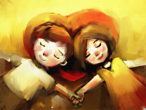 Digital paintings like this make generous use of dodge and burn to add glows, highlights and shadows. |
Our fox composite is just about done, but a little dodge and burn can add contrast and help our subject pop out of the background. We can also apply some blending modes and gradients to create a more vibrant color effect for our finished image. Follow along with this tutorial to find out how.
![]()
NARRATOR:
We’re getting close to being done with this image. I think we should make some final color adjustments before we’re done. First let’s look at the burn and dodge tools. You can find them right above the pen tool. The icon looks like a little hand making the shape of an O. And if you click and hold it you see also a magnifying glass, like a dark magnifying glass. That’s the dodge tool. The burn tool makes things darker. The dodge tool makes things brighter.
Let’s take a look at how this works. Really quickly, we’re going to make a new image. 576 by 576 is fine. Hit OK. We’re going to pick sort of a medium dark red and press M for the selection tool and draw a perfect square by holding down shift and then I’m going to fill the square with the foreground color and if we pick our burn tool we can add a shadow to the areas that we click on.
So we’re going to give this square kind of a quick little bevel pretending like the light is coming from here. So we’re adding a little bit of a shadow here. And if the burn tool makes things darker, the dodge tool is going to make things brighter.
Let’s go ahead and add a little bit of a highlight here. You can see the more you color with the paintbrush, the more it affects the lightness of the area. Some digital artists do a lot of their artwork this way. They will draw a solid shape, say for example, a character’s face, and then they’ll use the burn and the dodge tools to bring out the shading of the textures of that face.
Let’s go back to our fox. We’re going to do use the burn and the dodge tool to try to accentuate the fox and make the background sort of recede a little bit more. So first what we’re going to do is burn the background. Our brush right now is too small. Ninety pixels is much too small. Let’s make it maybe one thousand and we’ll click on the background layer and I want to just burn these trees. A good trick for working with backgrounds and foregrounds is to remember that in general, things that are dark tend to be less noticed by the audience and things that are bright tend to pop forward. So I’ve darkened the mid tones of this background image a little bit. Now let’s work on our fox. We want to bring him up. We want to brighten him up.
So I’m going to select him. I’m going to go back to the dodge tool. I’m going to make the tool bigger. A shortcut you can use is use the right and left brackets. So if you hold down the right bracket, it will make the brusher bigger. If you hold down the left bracket it will shrink the diameter of the brush. Right bracket, left bracket. I’m going to hold down the right bracket, make this brush a little bit bigger and then we’re just going to kind of hit the fox with a couple of quick clicks. We don’t want to overdue either of these tools. For example, we have some really nice detail on the fur on the fox’s back. If I dodge it too much, it turns completely white, and we lose that detail. So yeah he kind of looks like he’s glowing but that’s just too much detail that we lose. Bring a little of that back. Oops. That looks good. We’d also like to punch up his eyes a little. Use the left bracket, let’s zoom in a little bit. Let’s dodge his eyes somewhat. Let’s just make them a little bit more shiny to draw a little bit more attention. All right.
Let’s save this as fox04. And now what I want to do is I want to add a little color boost using a gradient overlay. Let’s make a new layer and we’re going to pick our gradient tool. Let’s go up and we’re going to grab one of the preset gradients it’s a violet to an orange and let’s just draw this gradient. We want the orange to be on the bottom and the violet to be on the top. And we’re going to name it “violet orange overlay.” As you cycle through these different blending modes, you can see the effect that this overlay has and depending on what you want to do, some of these might work for you. I think that the soft light looks the nicest. Kind of gives us some nice sepia tones in the middle and makes the fox look nice and orange and gives us a little more gradiation in the sky.
I do think that it’s a little bit harsh. It looks a little cartoonish. So I’m going to take the opacity of this overlay down. If you take it to zero, it removes it entirely. Bring it up a little bit to about 57% or 55%, something like that, always click to make sure it’s an improvement. And I think the last thing we’re going to do is we’re going to crop this image in so we really get the focus on our subject, the fox. So we can bring in this part of this image. Bring in the left side to get rid of some unnecessary information and let’s hit enter and let’s take one last look. Make sure our detail is all there. Ok, let’s save it one last time and just look at how this composite was built. We had a background, we added a screen moon. Here’s our fox. There’s some snow. Then we give it a little overlay to sort of punch up the colors.
