A great logo has a clear message, is instantly recognizable, and stands out from the competition. It's easy to remember, and gives the viewer an idea about what the company is or does.
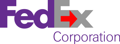
For example, the FedEx logo is a classic case of a well-designed and meaningful brand. At first, it might just look like letters on a page, but a close look at the negative space reveals a hidden message.

|
|
|
| Here's the logo for FedEx, a shipping company. | When you look at the negative space on this logo, you see a carefully-designed arrow pointing to the right. This symbolizes the company's mission to get your package where it's going. |
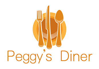
While it's important to convey what the company is all about through your logo design, avoid the temptation to be too literal with your imagery. A literal design is one that matches the company's product or service exactly. For example, a literal car company logo would be a picture of a car, or a logo for a surfboard designer would be a surfboard. These designs can come across as uncreative and forgettable. However, a logo that's too abstract might confuse customers about what type of goods or services they can expect.
|
|
|
||
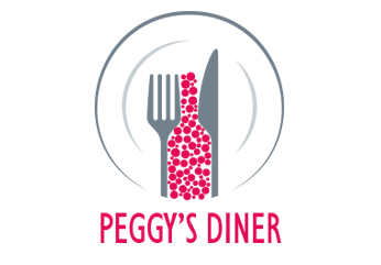
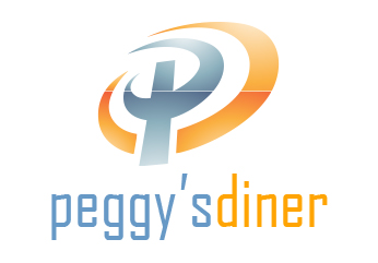
| This logo is too literal: it doesn't tell us anything about the food, atmosphere, or service at Peggy's Diner. Instead, all we get is a boring image of a plate and some silverware. | This time, the logo uses the negative space between the knife and fork to create a fun, bubbly design that tells us more about the kind of place Peggy's Diner is. | If you concentrate, you might be able to make out a "P" and "D" in this logo for Peggy's Diner, but the abstract design doesn't bring to mind a friendly place to get good food. |
Another quality of effective logos is their ability to pack a lot of meaning into a small, simple design. The logo for Amazon.com, an online retailer, is a useful example. The orange arrow under the company name evokes FedEx's symbolism, suggesting the company will deliver your packages quickly and efficiently. But the arrow shaft is also in the shape of a smile, and the arrow head looks like a dimple. This adds another layer of meaning, implying that Amazon's products, prices, and customer service will make you happy.

