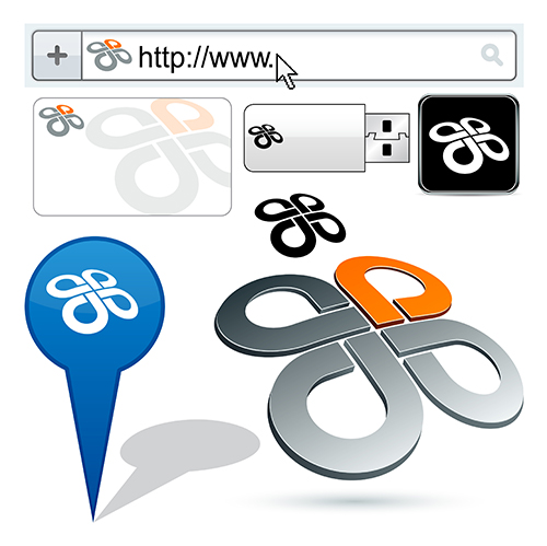
These days, it's not enough to make a logo that only looks good printed in a high-quality magazine ad. Today's logo designers have to think ahead and consider all of the various places their logo might end up. It might get photocopied in black and white on the company letterhead. It might show up as a tiny icon on a browser tab. It might appear on the homescreen of smartphones all over the world. It might even be printed twenty feet high on a billboard in Times Square.

|
|

|
|
Your logo might look good in a full-size version with lots of colors, but does it still work in black and white? Is it still recognizable as a tiny icon in an internet address bar?
|
|
Would your logo work as a large billboard in a major city center?
|
Here are some tips to help you design a logo that is flexible, functional, and suitable for all kinds of different applications.
- Design your logo using well-defined, basic shapes that look good in silhouette.
|
- Avoid drop shadows or fine lines that are hard to reproduce in black and white or on a small scale.
|
- Limit your color palette to a few basic colors. Avoid shading, transparency and gradients.
|
- Use contrast and negative space to your advantage. Create versions using only black and white to see if your logo still holds together.
|
- Stay away from putting lots of words in your logo. Using typography is fine, but stick to one or two letters as design elements. Words and sentences are impossible to read on a small scale. Make a separate treatment for company name and slogan designs.
|


