Based on feedback from your teacher and your own best judgment, it's time to turn your strongest sketch into a more complete version of a completed logo. Using drawing tools and image editing techniques, create a digital treatment of one logo design, adding color and using typography to give it a cleaner, more professional look.
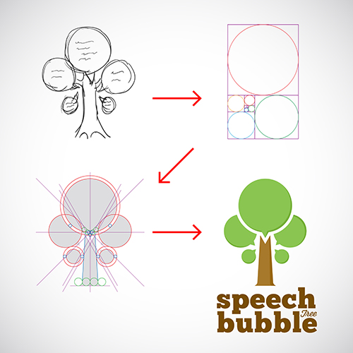
 Here's an example of the digitization process for a logo concept. The thumbnail sketch is scanned, and the key proportions and lines layed out on a grid. Then, shapes, colors, and text are added to finish the design. |
Chances are, your first digital draft of the icon will still need some work before the design is finalized. To help make the logo the best it can be, you can use a variation page to experiment with different color combinations, text placements, proportions, and styles to find the magic look. Submitting a variation page to a client is also a great way to get feedback about what direction they like most, and lets them pick different elements to mix and match as the design evolves into its final form.
 This designer has settled on a font and image for her logo, and has created a variation page to experiment with different treatments. Notice how the changes in color, placement, and proportion affect each design. |
To complete the next step of your logo design, make a variation page with at least nine different versions of your digitized logo. These designs should be mostly similar-- they should use more or less the same imagery, font, and color scheme. However, each variant should show noticeable differences, and highlight the important design choices that will affect the final logo's ability to meet the client's demands.
Your variation page will be graded using the following rubric:
Variation Page Rubric
| Criteria | |
| Digitized Version of Sketch 2 Points |
1 Point: You pick the strongest sketch concept to develop into a digital logo, based on teacher feedback and/or your own best judgment. |
| 1 Point: You create a clean, appealing digital version of your sketch, adding color, shapes, and typography. | |
| Design Specifications 1 Point |
1 Point: All of the logos on your variation page adhere to the design specifications of the project, and include a logo image, the name of the company, and its slogan. |
| Company Guidelines 1 Point |
1 Point: Each logo fits with the personality and guidelines of the company, including the adjectives that best describe EuWare and the preferred color scheme. |
| Variations 2 Points |
1 Point: Your variation sheet includes at least nine different treatments of the logo design. |
| 1 Point: The treatments are mostly similar, but you experiment with different color arrangements, proportions, and layouts to find the strongest logo version. |
