You've become an expert on the company. You've studied the art of logo design. You sketched multiple versions of logos. You experimented with several variations of this logo to find the best one. And now, it's time to polish and refine a final draft that's fit for branding an up-and-coming company as they grow and expand in the digital market.
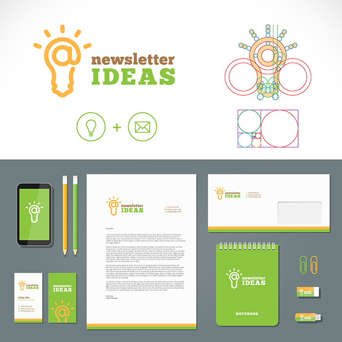
 This designer has created not only a new logo for her client, but also several branding guidelines for how the logo might be used in different media. |
For the final step of your project, you will be turning in a final, polished version of your logo design for EuWare, as well as several different examples showing how the branding can be expanded into different media. You'll place the logo as an icon on a smartphone screen, as letterhead at the top of a black and white letter, and as a billboard on the side of a bus stop.
First, choose the best variation from the previous assignment and create a final, digital version of your EuWare logo design. Double-check that you meet all of the requirements and goals from the design brief and the project overview.
Then, download these three files, and composite your logo into each media environment.
| Icon for smartphone screen (image logo only): |
 |
 |
| Black and white letterhead branding: |
 |
 |
| Bus stop billboard ad: |
 |
 |
You will have to customize a new version of your logo for each media use: for example, you need a black and white version for the letterhead branding guide, and a square image-only logo for the smartphone screen. When you've finished, turn in all four files to your teacher.
Your final logo and branding guides will be graded using the following rubric.
Final Logo Design and Branding Guide Rubric
| 5 Expert | 3 Strong | 1 Beginning | |
| Design Brief and Project Overview | All logo designs perfectly satisfy the requirements of the design brief and project overview, and use imagery, color, and typography to create a successful and communicative brand for EuWare. | Your logo design mostly satisfies the criteria laid out by the design brief and the project overview, and does a good job representing EuWare's mission and vision. | Your logo design ignores many important criteria demanded by the client, and does not communicate the mission and vision of EuWare or its creative guidelines. |
| Final Logo | Your final logo is clean, professional, and powerful, and represents the culmination of a thoughtful and rigorous design process. You include an image, the company name, and its slogan. | Your final logo is well-designed and effective, and shows evidence of evolution and progress between drafts. You include an image, the company name, and its slogan. | Your final logo looks unfinished or unprofessional, and seems like it's still in the early stages of the design process. The logo image, company name, and/or slogan may be missing. |
| Smartphone Branding Guide | The image-only version of your logo fits perfectly as a smartphone icon, and brings a strong brand to the mobile media market. | The image-only version of your logo looks pretty good as a smartphone icon, and is a recognizable brand in the mobile media market. | The image-only version of your logo looks out of place or distracting on the smartphone screen, and is unlikely to stand out in the mobile media market. |
| Letterhead Branding Guide | The black and white version of your logo is clear and legible, and maintains its effectiveness as a brand in the print media market. | The black and white version of your logo is appealing, and still works as a brand identity in print media. | The black and white version of your logo loses too much of its effectiveness, and is hard to recognize in print form. |
| Bus Stop Branding Guide | The billboard version of your logo is eye-catching and unique, and provides a powerful example of how the new brand will attract customers through advertising. | The billboard version of your logo is attractive and effective, and helps the client understand how your design will be used in advertising. | The billboard version of your logo is uninteresting or poorly designed, and doesn't help the client imagine how their brand will spread through advertising. |
