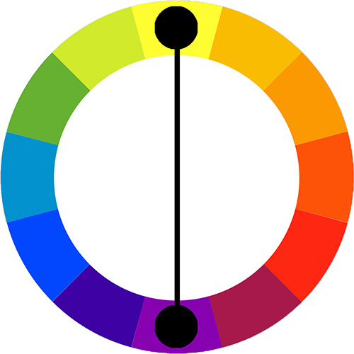
 Complementary color schemes are made by using colors located across from each other on the color wheel. All colors have a complement, but the common complements are orange and blue, yellow and purple, and red and green. If used in unequal proportions, complements work great together and are quite dynamic. In general a 50/50 proportion creates a visual vibration (and makes it difficult to look at the image). Complementary color schemes are frequently used for logos and athletic uniforms because of their striking effect.
When choosing complementary colors, fully saturated or pure colors will offer the highest level of contrast. Choosing from tints or shades within the hue family reduces the overall contrast of the composition. But remember, it is acceptable to combine complementary colors within your composition to neutralize the colors, as long as they have a clear relationship.
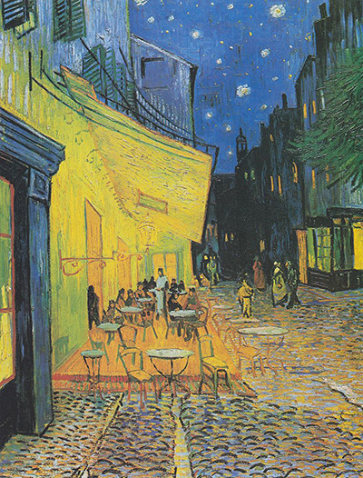 van Gogh uses complimentary hues of orange and blue to create emphasis and contrast in his painting. |
Question
Can you think of any other place or time of the year when complements are used?
