 The split-complementary scheme is a variation of the standard complementary scheme. It uses a dominant color and the two colors next to its complement. This gives the artwork high contrast without the strong tension of the complementary color scheme, and creates a new visual effect. However, a split-complementary scheme is harder to balance than the monochromatic and analogous color schemes. Many designers use a single warm color against a range of cool colors to put an emphasis on the warm color, or use a single cool color emphasized by warm colors.
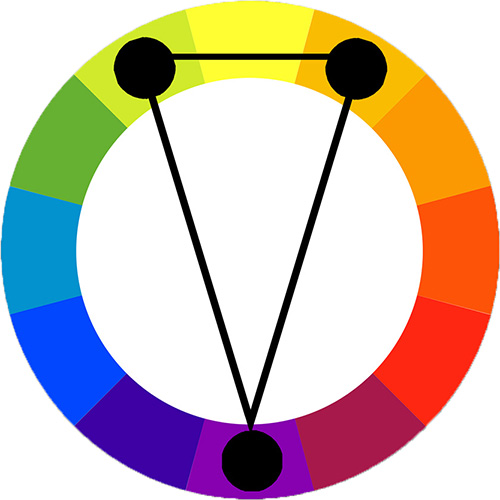
There are 12 basic possible variations in split-complementary color relationships. In the example at right, the three colors connected are red, yellow-green, and blue-green. Green is the complement of red, but in a split-complementary color scheme, the colors adjacent to the complement are used instead of the true complement.

|
This logo for a wine list uses a split-complementary color relationship, with a cool violet as the dominant color and the split compliments green and orange to accent it. |
