When certain colors are put together, we call them color combinations, or color schemes. When planning colors for a design, decide what feelings you want to create in the viewer and what color scheme will accomplish that. If you want a bold, attention-grabbing effect, try using colors with high contrast and intensity. For a more subtle and sophisticated approach, you might use similar colors that are more muted.
 This picture uses bold, bright primary colors to create a vibrant effect. |
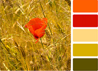 The color palette of this poppy picture includes warm reds, oranges, and browns. |
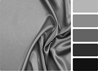 This achromatic image uses only shades of gray to create an elegant feel. |
Achieving a successful combination of colors begins with the understanding of color relationships. Strong color schemes have visual balance and harmony between contrasting color combinations. Poor color schemes look confusing, muddy, or distracting.
