 When babies turn two, we start to call them toddlers. Why? Because they're learning to balance. They "toddle" back and forth, training their new nervous systems to crawl, stand, walk and run with confidence. But just because we learn to balance at a young age doesn't mean it's easy. The world's best engineers still struggle to make robots that can walk on two legs without flopping over, and we have to learn to balance all over again when we first try biking, or karate, or surfing.
Why is balance so hard to get right? Balancing requires a constant feedback loop: the tiniest change on one side needs to be countered by an immediate correction on the other. Correct too much, not enough, or in the wrong way, and the whole thing comes crashing down.
Balance in design is just as important as balance in daily life, and just as delicate to master. Visual balance is the way that the different parts of a composition relate to one another. It's one of the first things designers should think about when laying out and composing a new work. When figuring out if a work is balanced, designers must consider all the elements of art—types of shapes, placement of shapes, sizes, and color of shapes, texture, value, etc. How they are arranged or balanced has a lot to do with whether or not the final work is successful.
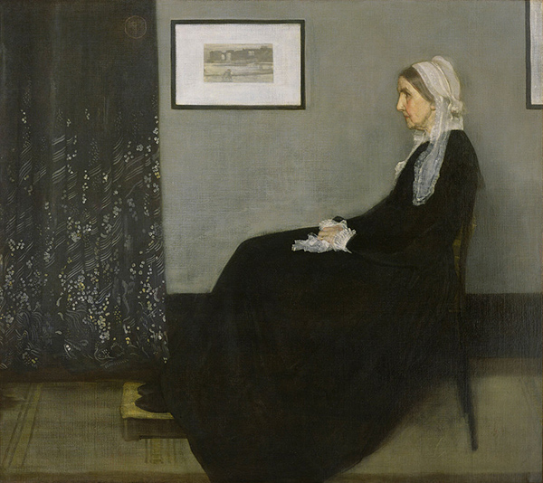
Below is one of the most iconic American paintings of all time, Arrangement in Grey and Black No.1, more commonly known as Whistler's Mother. Click the image below to see how Whistler brilliantly balances the portrait of his mother in this composition.

