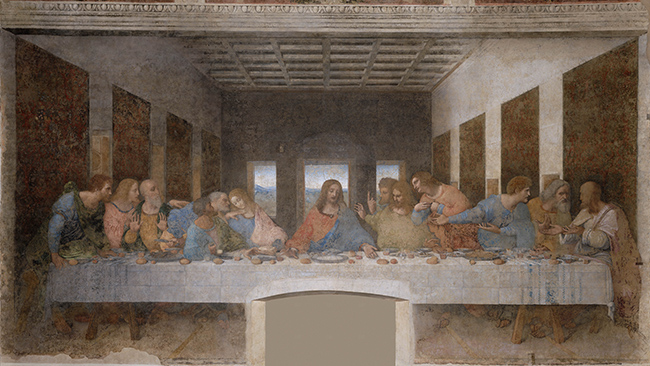
Although symmetry is the simplest way to create a visually balanced design, it can be predictable and monotonous, and fail to hold a viewer’s attention. Because there is so much exact repetition, the effect can be static and lack movement. It's kind of like a public speaker who doesn't change their voice from word to word: they speak in a boring monotone that soon puts the crowd to sleep. Most designers will spice up their compositions by adding variations to their balance and symmetry.
The image below has a line of symmetry; but some elements on each side have been altered to make the design more dynamic. This approximate symmetry creates both balance and variation.

Look in the mirror and you'll see that your face is mostly symmetrical. However, one eyebrow may be a little higher than the other, or your nose may not be perfectly straight. You might have more freckles in different places on one side or the other, or a dimple on one cheek only. These features add character, in the same way that slightly asymmetrical designs hold our interest longer than perfectly symmetrical ones.
Designers often choose to create designs with approximate symmetry, where the two sides of a composition are similar, but varied. They keep the viewer engaged by creating a sense of balance without an overly-predictable and static composition.

The Last Supper, by Leonardo da Vinci, is nicely symmetrical and balanced on both sides. There are six figures on each side of Jesus (center), and the background and architecture are mirrored down the middle. However, the composition isn't perfectly symmetrical: the disciples all affect different poses and expressions, giving the painting variance and interest.
