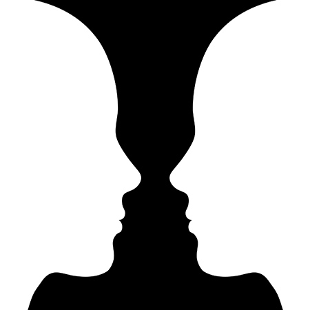
When it comes to art, space is how we talk about the areas that surround, break up, or go through the different artistic elements. Positive space is the part of a design that is filled with a shape or form that the designer wants to be the focus of the design. Negative space is the area around the positive space that isn’t the focus of the design. Some optical illusions rely on switching positive and negative spaces back and forth to trick your eyes. In this classic example, when you think of the positive space as white, you see two faces. But if you switch the positive space in your mind to black, you see a vase!

Positive and negative space can sometimes trade places in the same image! Here, when you focus on the faces, the black becomes negative space, but when you shift your focus to the vase, the white becomes negative space.
Positive and negative space does not refer to the colors or value in a design, but instead how surrounding areas (like backgrounds) can draw attention to the main subject. In all three images below, the elephant is in the positive space while the background is the negative space.


If there is not a clear separation between the positive and negative space the design will not have a focal point. This can cause the viewer to have a hard time deciding where they should be looking.


