While there are smaller strategies you can try to optimize the performance of your website in search engines and improve your rankings on sites like Google and Yahoo, the best and most important step happens at the very beginning of the web design process. That's when you make decisions about how the site will be organized and what design elements will recur to create consistency across the site.
The way you organize the content on a website is called information architecture. Like an architect creating blueprints for a building, you should plan what will appear on each page of your website and what elements will carry over from page to page to create a pleasing sense of unity for visitors. While you can change these aspects of your website after you create it, it's much more difficult to do, so you should keep usability and SEO in mind as you're designing the site.
Specifically, here are the design and "architectural" elements that contribute most to a usable design.
Headers
Layout
Navigation
Contact Us
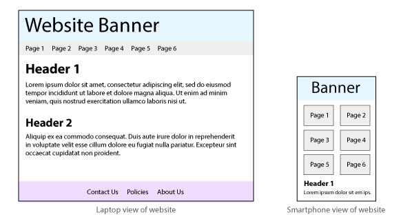
Mobility
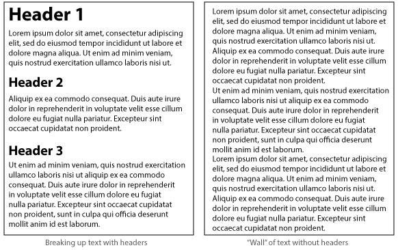
A visitor to your site who encounters a "wall" of text is likely to disappear before even beginning to read. In the online context, readability means the ability to read content quickly—to scan it, in fact. And one of the best aids to a reader trying to scan text is the header tag. Using headers strategically helps break up your content into more manageable "chunks" while also showing visitors at a glance what is covered on the page. (The algorithms used by search engines typically favor keywords that appear in header tags.)
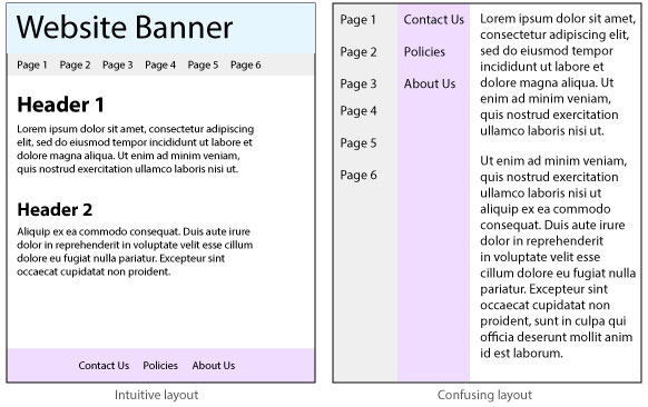
The way you arrange elements on a page can help a visitor grasp what the page is about and what information it contains. This is exactly what Internet users want to see, and most have learned to expect it—they won't dwell on your site long if they have to work (think) very hard to understand what a page is about. Help them by using font sizes and types that are easy to read, using bold types and colors sparingly, including lots of empty "white space" around important elements, and organizing content visually, with tabs, tables, rollover elements, and dropdowns.
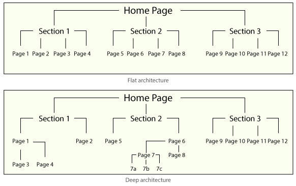
The links that visitors use to navigate, or move around in, your website are the visible results of the site's information architecture. And architecture is something you decide at the very beginning of a web design project. In general, a "flat" site architecture makes content much easier for a user to find. It also makes content easier for a search engine to identify as it "crawls" through the site looking for possible keywords. If it finds these in the "top" levels of the architecture, it gives the site higher priority for searchers looking for those search terms.
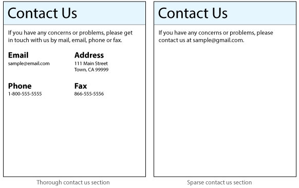
As you probably know from your own web surfing, especially if you look for local businesses or services online, a Contact Us page is not only helpful but also reassuring. For instance, if you want to join a gym and the gym's website does not include the kind of information that typically appears on a Contact Us page, such as a phone number, email address, or physical address, you're likely to leave that gym's website and check out another. Most search engines consider websites with Contact Us pages more trustworthy and legitimate.
Some search engines have started penalizing websites that are not designed in a way that makes it easy for users on different machines and platforms to view the content. With the prevalence of smart phones as a means of connecting to the Internet, building a website that does not look good or appear readable on a phone screen is a bad idea. Doing so will automatically reduce the usability of your site for a huge number of Internet users. And since smartphone users represent a high percentage of search engine users, search engines are going to be particularly concerned about the flexibility of your website.