Like the shorthand CSS properties margin, padding, font and border, CSS grid has several of its own shorthand properties. Shorthand properties help keep your code clean and concise while maintaining legibility. It's always best to master the individual properties before attempting the shorthand versions.

You have already been introduced to one CSS grid shorthand property, and that's grid-area. This property can do more than just name grid areas! Below are the shorthand properties available for CSS grid layouts. Click each tab below to see which properties are combined in the shorthand version and what the code looks like.
The grid-column property combines the properties grid-column-start and grid-column-end.
| grid-column: grid-column-start / grid-column-end; |
Likewise, grid-row combines the properties grid-row-start and grid-row-end.
| grid-row: grid-row-start / grid-row-end; |
Here’s a familiar example:
<style>
.item1 {
  grid-column-start: 1;
  grid-column-end: span 3;
}
.item2 {
  grid-row-start: 2;
  grid-row-end: 4;
}
</style>
The same values are present but condensed into the shorthand version of the property.
<style>
.item1 {
  grid-column: 1 / span 3;
}
.item2 {
  grid-row: 2 / 4;
}
</style>
The grid-area property can do one of two things.
It either specifies a name for the grid item:
| grid-area: itemname; |
OR
It is a shorthand property for the grid-row/column-start/end properties:
| grid-area: grid-row-start / grid-column-start / grid-row-end / grid-column-end; |
<style>
.item1 {
  grid-area: 1 / 2 / span 2 / span 3;
}
</style>
Let's break it down...
grid-area: grid-row-start / grid-column-start / grid-row-end / grid-column-end;
- grid-row-start is set to line 1
- grid-column-start is set to line 2
- grid-row-end is set to span 2 rows
- grid-column-end is set to span 3 columns
The grid-template is another property that pulls double duty!
It is either the abbreviated property for grid-template-area:
| grid-template: grid-template-areas; |
OR
It is the shorthand for grid-template-rows and grid-template-columns:
| grid-template: grid-template-rows / grid-template-columns; |
<style>
.item1 {
  grid-template: 200px 1fr / auto 50% auto;
}
</style>
Let's break it down...
This code shows us that there are two rows and three columns explicitly designated.
- the first row is 200px high
- the second row is 1 fractional unit high
- the first and third columns are set to auto
- and the second column is set 50%
Note: Just like with grid-template-columns and grid-template-rows, you can use repeat() if all your columns or rows are the same designation!
<style>
.item1 {
  grid-template: auto auto auto / 1fr 1fr 1fr 1fr;
}
</style>
is the same as...
<style>
.item1 {
  grid-template: repeat(3, auto) / repeat(4, f1r);
}
</style>
The gap property combines row-gap and column-gap together.
| gap: row-gap column-gap; |
<style>
.item1 {
  gap: 25px 50px;
}
</style>
In this example, the row-gap is set to 25px, and the column-gap is set to 50px.
The grid property is the ultimate multitasker! This property is an even shorter shorthand for the following:
| grid: grid-template-rows / grid-template-columns |
| grid: grid-template-areas |
| grid: grid-template-rows / [grid-auto-flow] grid-auto-columns |
| grid: [grid-auto-flow] grid-auto-rows / grid-template-columns |
Notice that grid-auto-flow, when on the left side of the slash represents row and when on the right, represents column. dense can be added to either, if needed.
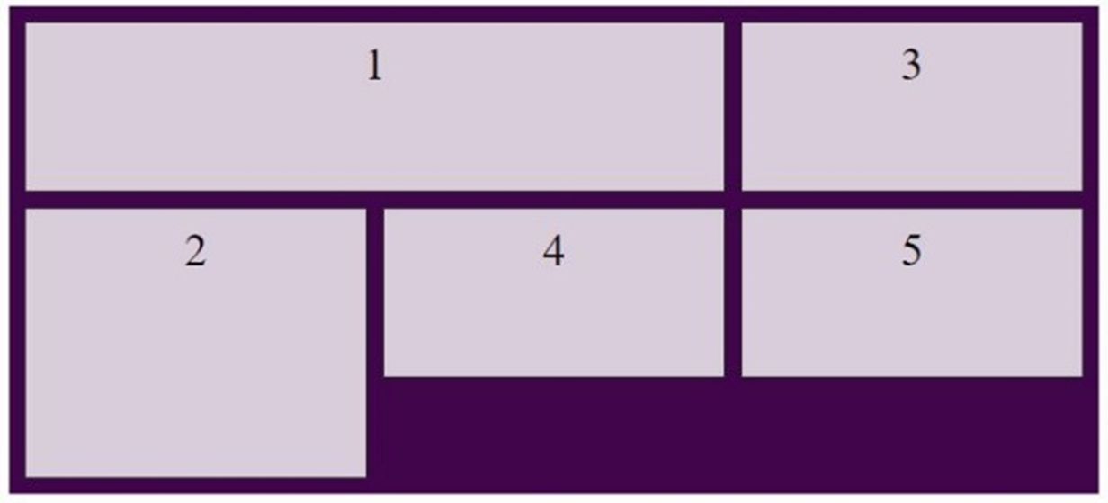
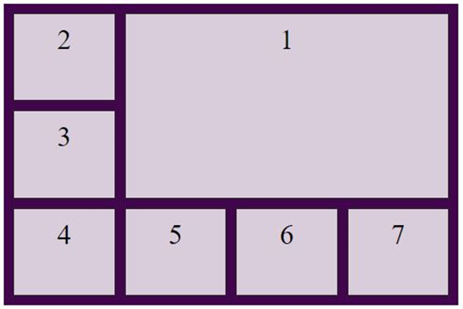
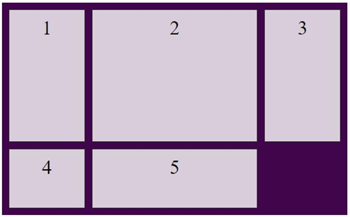
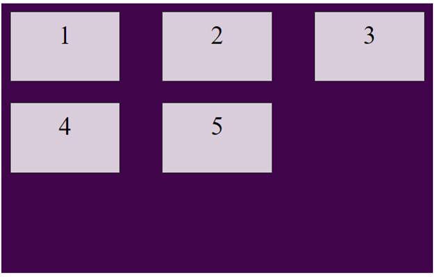
When using the grid property, you can specify either the explicit OR the implicit grid properties in ONE direction for each individual declaration. Click on the images below to see the code samples for each layout.


You Try!
Using your own text editor or the coding space below, practice using your shorthand CSS grid properties. Try building out a grid first and then see if you can replace the grid container and grid item properties by swapping them out with their shorthand counterparts! When you feel like you've got a good understand of CSS grid and the shorthand properties, move on to the next page to view your lesson assignment.
