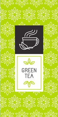
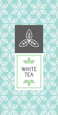
For this project, you will be designing the packaging for a new line of tea. Your design will be based on the target demographic that the client is looking to market towards. The product is a new coffee alternative tea that is caffeinated and infused with different fruit flavors.
You can decide the type of fruit used in the product, you are not limited to any predetermined colors or shapes. You will not have to include a brand name or logo on your packaging. Your design should focus on appealing design elements and communicating information about the flavor.
The blurb below explains your client's target demographic.
Target Demographic
The target demographic is mostly female customers who are between the ages of 18 and 35. The customers are more health conscious and interested in alternatives to coffee. They want a product that appears healthy and makes them feel like they are making healthy decisions. The target demographic also prioritizes spending on items that are geared towards fitness and well-being.
You will need to think about what might appeal to the given target demographic. What colors would draw in the attention of female customers in the desired age range? What colors, shapes, and designs are used by other products in the fitness and health food market for women 18 to 35?
You may need to do some additional research for inspiration by searching the internet or by walking around a store. It will help if you brainstorm and make a list of different design elements to use before you begin the design process. List the colors, shapes and other elements you think would work for your target demographic. That way, when you begin designing, you have a collection of assets ready to apply to your work.
You can decide on the dimensions and style of the container that you want to design. For simplicity's sake, you will design only the front of the package as if you were look straight at it. This could be as straight forward as rectangle with your design in it. The examples below show how this project might be accomplished with more traditional teas that are fairly generic and appeal to a wide demographic. Your design should contain more visual energy to match your target demographic.
Example 1
Example 2
Example 3


Critiquing
For this project, you will be submitting your work for critique before you submit your final version to be graded. This is a great way to get feedback on your work before it is finalized and make any improvements. When you feel like your project is far enough along to represent your final idea, but before you finish your design, submit your work to be reviewed. Remember, how you use the feedback you received is completely up to you. Your critique will not be graded and is intended to help improve your final grade.
Be sure to label each file with your name and the project name. This will make sure that your instructor can grade your work properly.
Use the rubric below to see how each of your items will be graded so that you are able to receive the highest possible grade. Your final project will be worth 15 points.
| 5 Points - Excellent | 3 Points - Good | 1 Point - Poor | |
| Functionality | The packaging clearly and effectively completed the function of appealing to the target demographic. | The packaging is appealing to the target demographic. | The packaging is not appealing to the target demographic. |
| Quality | The packaging is highly appealing and effectively follows the elements of art and the principles of design. | The packaging is appealing and uses the elements of art and the principles of design. | The packaging design is distractingly messy or very poorly designed. |
| Effort | The packaging design shows an exceptional degree of student effort. | The packaging design shows an adequate amount of effort. | The packaging design shows the minimal amount of effort. |
