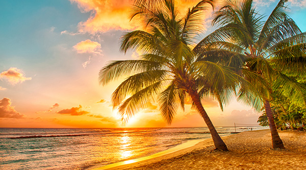
It can be difficult for images to produce a desired effect across the board on different devices. On a larger display, you can have a big, beautiful image that spans the screen. But that same image viewed on your phone is a nuisance. It will either cause a lot of horizontal scrolling, or the phone will automatically resize the whole page to accommodate images, making everything else tiny!

This type of display discrepancy happens when fixed dimensions are set for images. That's why setting exact image dimensions is typically discouraged in modern design practices. Click through the tabs below to see a few ways you can use images in a responsive layout, depending on your method of design.
Instead of a fixed width, you can use a percentage—for max-width. In fact, you won't set the normal width at all. A max-width of 100% allows the image's width to decrease along with the viewport, while never getting wider than the original file's actual width, which avoids any pixelation. Just be sure to set the image's height to "auto" so that the height always adjusts proportionally as the width changes with the viewport.
img {
  max-width: 100%;
  height: auto;
}
Widescreen Monitor
Example
Smartphone Screen
Example
Percentage widths, especially when paired with min-width and max-width, can give you a lot of control when working with a grid of images. If the images are all contained within a div, the div can take on a min-width and max-width to ensure that it will adjust, but never get too cramped or too stretched out. Thankfully, images will wrap to the next line if they run out of space. But you may end up with unexpected white space or a layout that just doesn't look the way you expected. In this instance, you can take advantage of media queries to ensure that a nice grid is always intact and adjusted to alternate viewports.
div.seasons {
  display: flex;
  flex-direction: row;
  align-items: flex-start;
  align-content: flex-start;
}
@media (max-width:500px) {
  div.seasons {
    flex-wrap: wrap;
    align-items: center;
  }
}
Without media query

With media query
As an additional measure to optimize image use, a more recent HTML tag has been introduced called <picture>. It contains an image-tag, as well as a <source> tag to set parameters for an alternate image option.
<picture>
  <source media="()" srcset="image-link"/>
  <img src="image-link" alt=""/>
</picture>
It can adopt multiple <source> tags to make multiple image options available. These <source> tags also use a new attribute to set the image URLs—"srcset". By placing media queries on the <source> tags, you can select entirely different pictures depending on how the page is viewed.
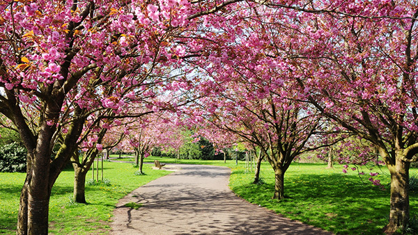
For example, on a large display, you may have a wide, zoomed-out picture of some cherry trees. However, it would be hard to see any detail on a phone display, so that image can be replaced with one that is more zoomed in on the cherry blossoms. This offers more visual detail on a smaller viewport.
<picture>
  <source media="(min-width:800px)" srcset="blossom_trees.jpg"/>
  <img src="cherry_blossoms.jpg" alt="cherry blossoms"/>
</picture>
Widescreen Monitor
Example
Smartphone Screen
Example