Analyze Data on Different Graphs
Let’s watch a video about analyzing data on different graphs!
Goal:
Goal:

Learn!
Goal: Analyze data and solve problems using graphs.
Tank the Robot will continue our subway journey to analyze different graphs. Let’s watch a video about solving problems using graphs!
Let’s go underground on the New York City subways! Tank is here to help us solve problems using graphs at each stop of the subway trains. Are you ready? Let’s ride!
First subway stop: Line plot graphs!
Tank wants to make sure you understand all of the parts of the line plot graph.
We have the title of the graph: “Time Riding the Subway.”
We have the scale that shows the number of students being counted.
Our labels represent the different lengths of time the students spent traveling. We put them in order from least to greatest on the number line.
Let’s move to our next stop!
Let’s review and analyze the line plot graph from our lesson!
Do you remember what makes a line plot graph different from all other graphs?
Correct! Line plot graphs have a number line and use Xs to represent data.
Let’s analyze!
How much time did most of the students spend riding the subway?
Most of the students spent 30 minutes riding the subway. There are 10 Xs above the column marked “30 minutes.” So there were 10 students who rode the subway for 30 minutes.
How many more students rode the subway for 30 minutes than for 45 minutes?
To find the answer, we can subtract the number of students who rode for 45 minutes (8 students) from the number who rode for 30 minutes (10 students). 10 minus 8 equals 2. So, 2 more students rode for 30 minutes than for 45 minutes.
You are on the fast track! Way to go!
Second subway stop: picture graphs!
Let’s review and analyze the picture graph from our lesson!
Do you remember what makes a picture graph different from all other graphs?
Great! Picture graphs use actual pictures to show, or represent, the data.
Tank wants to make sure you understand all of the parts of the picture graph!
What is the title of our graph?
Remember, the title is always at the top of the graph. “Student Activities on the Subway” is our title.
What does the data in the graph show? It shows us the number of students who ride the subway and what they do during their trip.
Do you remember tally marks? How many tally marks could we use to represent the number of students who listen to music? If we were collecting data for this graph, we would use 4 lines and a slash to show 5 in tally marks. One, two, three, four, and a slash.
Let’s analyze!
How many students listen to music on the subway?
That’s right! 5 students listen to music while riding the subway train!
How many students do not do homework on the subway train?
This is a little tricky. We have to count all of the students who do not work on their homework. 5 students listen to music, 6 students talk to friends, and 3 students play video games. We can add all of them together: 5 + 6 + 3 = 14. So, 14 students do not do homework on the train.
Third subway stop: bar graphs!
Tank wants to make sure you understand all of the parts of the bar graph!
Do you remember what makes a bar graph different from all other graphs?
Bar graphs use bars to represent the data.
What are the labels of our bar graph?
Excellent work! Each label represents a different color of subway train that students traveled in. There are a red subway train, a blue subway train, a purple subway train, and a silver subway train.
The colors on our bar graph correspond to the trains’ colors.
Let’s analyze!
How many students rode the purple train or the red train?
Brilliant! To find the answer, we can add the 9 students who rode the red train and the 6 students who rode the purple train. 9 + 6 = 15. So, 15 students rode the red or purple train.
How many more students rode the silver train than the blue train?
Let’s subtract! 10 students rode the silver train, and 8 students rode the blue train. We can subtract 10 - 8 = 2. So, 2 more students rode the silver train than the blue train.
Way to analyze!
Tank the Robot has a special message for you!
Thank you for solving problems using different kinds of graphs on the New York City subways. You are a pro!
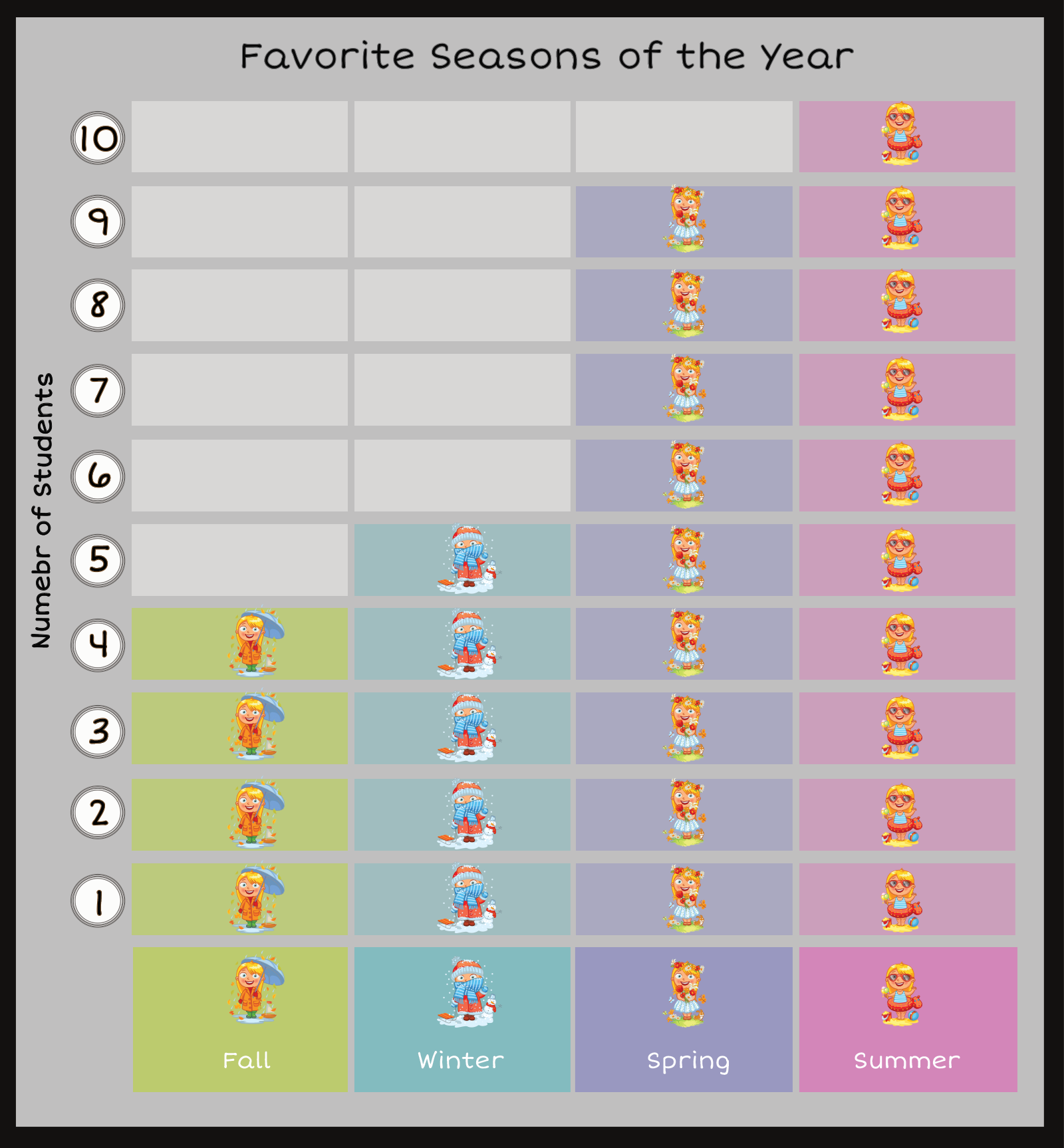
Use the following picture graph to analyze the data of students’ favorite season of the year. Click on each question to see the answer!

Excellent! Only 4 students picked fall as their favorite season. |
|
Great! 4 more students chose spring as their favorite than chose winter. 9 – 5 = 4. |
|
That is right! 18 students picked the other 3 seasons as their favorite. 9 + 5 + 4 = 18. |