As you apply margins, padding and borders, it’s easy to lose track of which element is responsible for gaps of space on the page, or how much room these elements are actually taking up on the page.
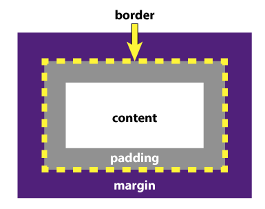
A popular visualization for the application of these properties is called the Box Model (pictured below). Starting from the content itself and working outward, you can see the padding surrounds the content, but is within the element. Then, the border goes around the edge of the element. And finally, the margin serves as space outside of the element.
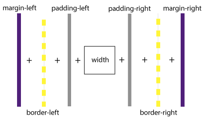
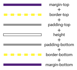
Each of these properties adds to the size of your element, so you need to consider this sum when fitting pieces of your website together. To figure out how much space is occupied across a line, you take the set width of the element, plus the size of any left and right padding, the thickness of any left and right border, and then the size of any left and right margin. The same is done to see how much space is taken going down the webpage, but instead, you use your element’s height, and the top and bottom values of each property.
As an example, say you have a 600px-wide div. Inside it, you would like to place two images side-by-side, each with a margin of 10px, and a 2px dark gray border. How wide can the images be to fit properly into this div?
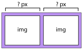
First, we need to see how much space our additional properties are going to take up. Each image will have 10px of margin on the left and right, so that’s a total of 40px. Then, each image will have a 2px border, so taking the left and right border of each of the two images gives us 8px worth of border to take into account. So we’re at a total of 48px that our extra properties have taken up.
Subtract the 48px from the 600px for the div’s width, and you have 552px left for the images themselves. Divide that in half, and you get 276px as the widest you can make each image.
10 + 2 + 276 + 2 + 10 + 10 + 2 + 276 + 2 + 10 = 600
