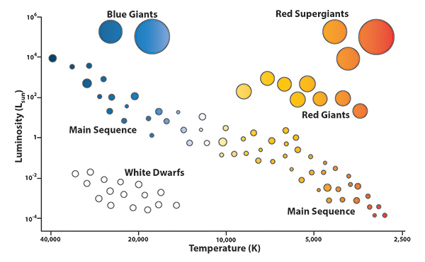
Throughout the universe, there are stars with varying luminosities and temperatures. Scientists use a tool called the Hertzsprung-Russell (H-R) diagram to show relationships between stars with varying properties. Go through the following tabs to learn more about H-R diagrams.
A simple H-R Diagram
Luminosity Ranges
Temperature and Color
Main Sequence Stars
This is a simple H-R diagram that shows you the basic information that H-R diagrams convey. Stars are shown on the diagram depending on how they range in terms of luminosity and temperature. Luminosity is on the y-axis, and temperature is on the x-axis. Note that on the x-axis, temperature decreases from left to right, so that the hottest stars are shown on the left side of the diagram.

Luminosity is shown on a relative scale. The stars are given luminosity values depending on their relative radiance compared to our sun. Our sun is given a luminosity value of 1. All other stars are either below 1 or greater than 1, depending on whether they are less luminous or more luminous than our sun.

Note how the hottest stars are depicted as blue and the coolest stars are depicted as red. This is a representation of the fact that a star's color depends on its temperature.

The stars that run diagonally from top to bottom of the graph are the main sequence stars, such as our own sun. These stars follow a general trend of being brighter when they are hotter. They are burning hydrogen in their cores.

