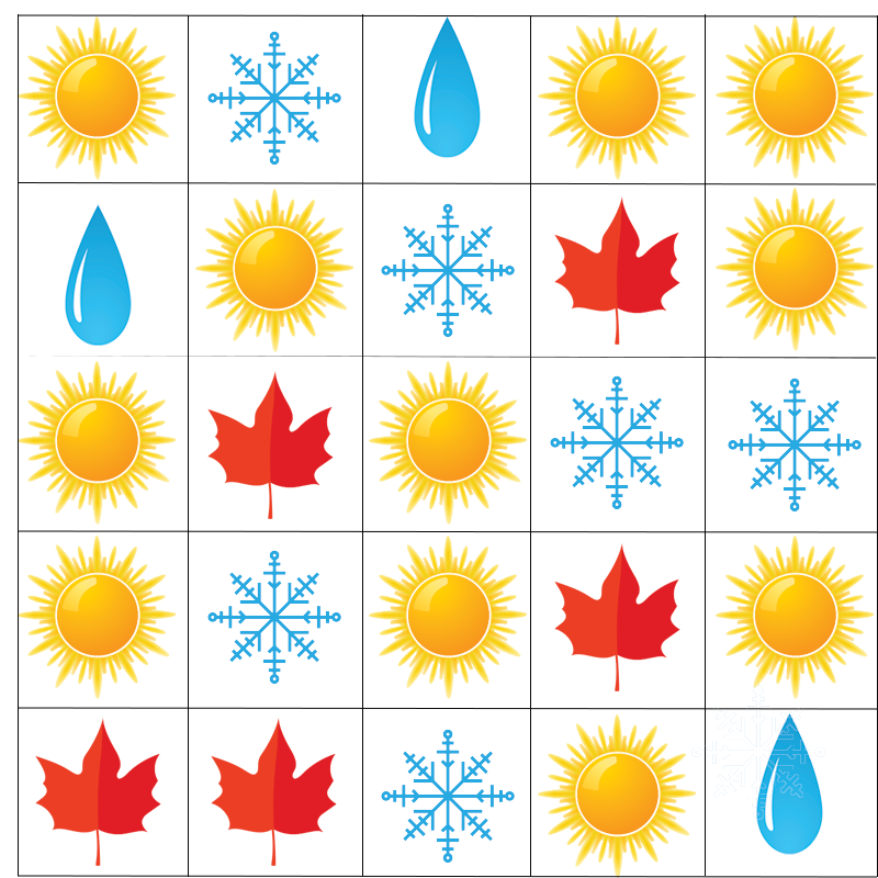
Mariana lives in the United States. She asked her classmates if they like summer, winter, fall, or spring best. Here is the data Mariana collected:
Goal:
Goal:

Goal: Organize data and create graphs.
Now it is time to make your own pictograph and bar graph. Are you ready? You will need this graphing paper , crayons, and a pencil.
 Hands-On

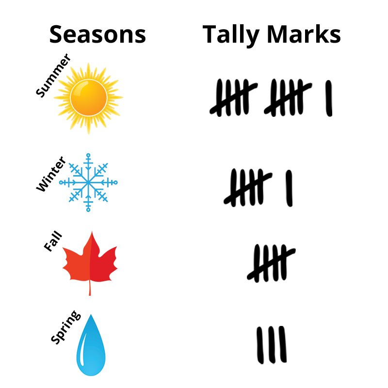
First, make your tally chart.
Mariana lives in the United States. She asked her classmates if they like summer, winter, fall, or spring best. Here is the data Mariana collected:
Each sun represents a student who likes summer best. Can you add tally marks for each of these students?
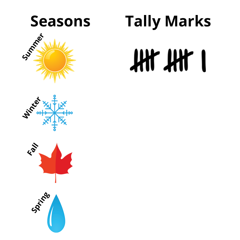
11 students prefer summer.
Each snowflake represents a student who likes winter best. How many tally marks will you make for those students?
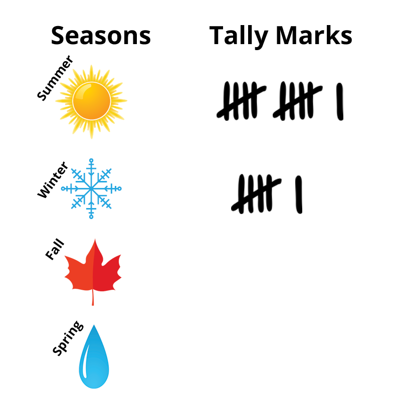
6 students prefer winter.
The leaves represent students who like fall best. How many tally marks will you make for those students?
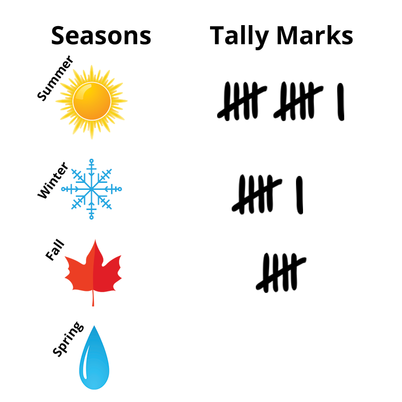
5 students prefer fall.
Each raindrop represents a student who likes spring best. Can you add tally marks for each of these students?

3 students prefer spring.
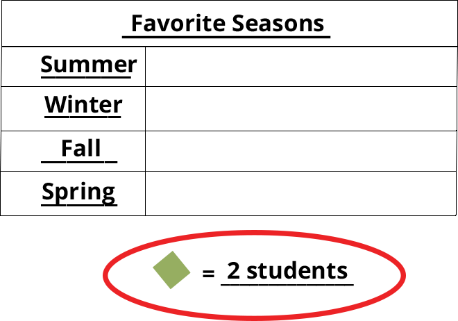
Nice work! Your tally chart is done. Now you are ready to make a pictograph.
Next, make your pictograph.
The title of the pictograph goes at the top. It tells us what the graph is about. Let’s write Favorite Seasons on the line at the top of the graph.

The labels go on the side of the graph. They list the different seasons in the graph. Let’s write Summer, Winter, Fall, Spring.

The symbol and key are at the very bottom of the graph. The symbol in this pictograph is a diamond. The key tells us how much each diamond is worth. Let’s make each diamond equal 2 students.
Our tally chart says that 11 students like summer best. Use a green crayon to draw 5 and a half diamonds next to Summer.

6 students like winter best. Use a green crayon to draw 3 diamonds next to Winter.

How many students like fall best? Draw those diamonds next to Fall.

How many students like spring best? Draw those diamonds next to Spring.

You did it! Your pictograph is complete.
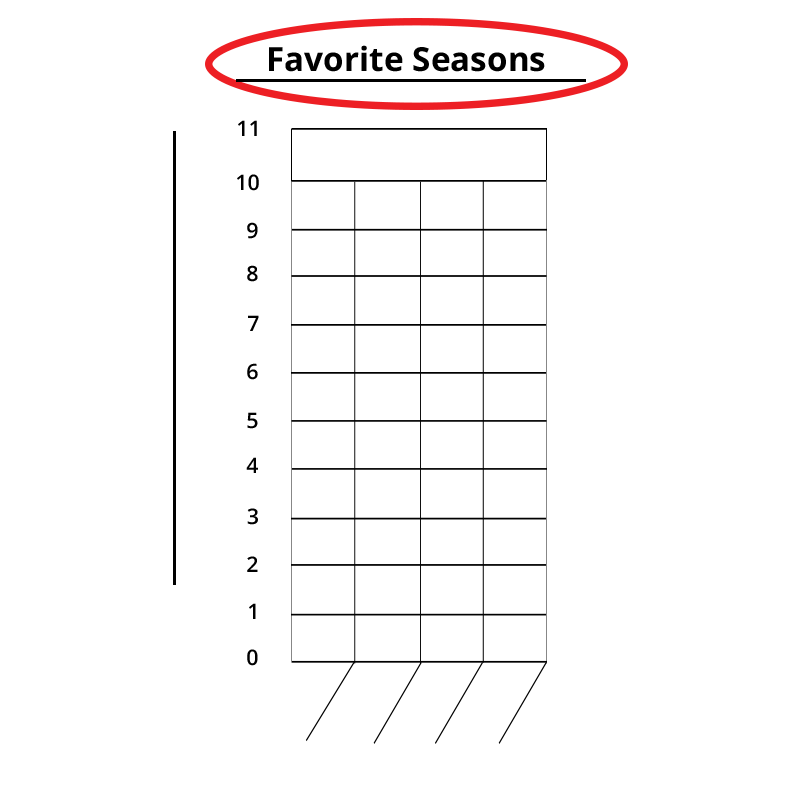
Finally, make your bar graph.
Let’s start with the title. Write Favorite Seasons at the top of the bar graph.
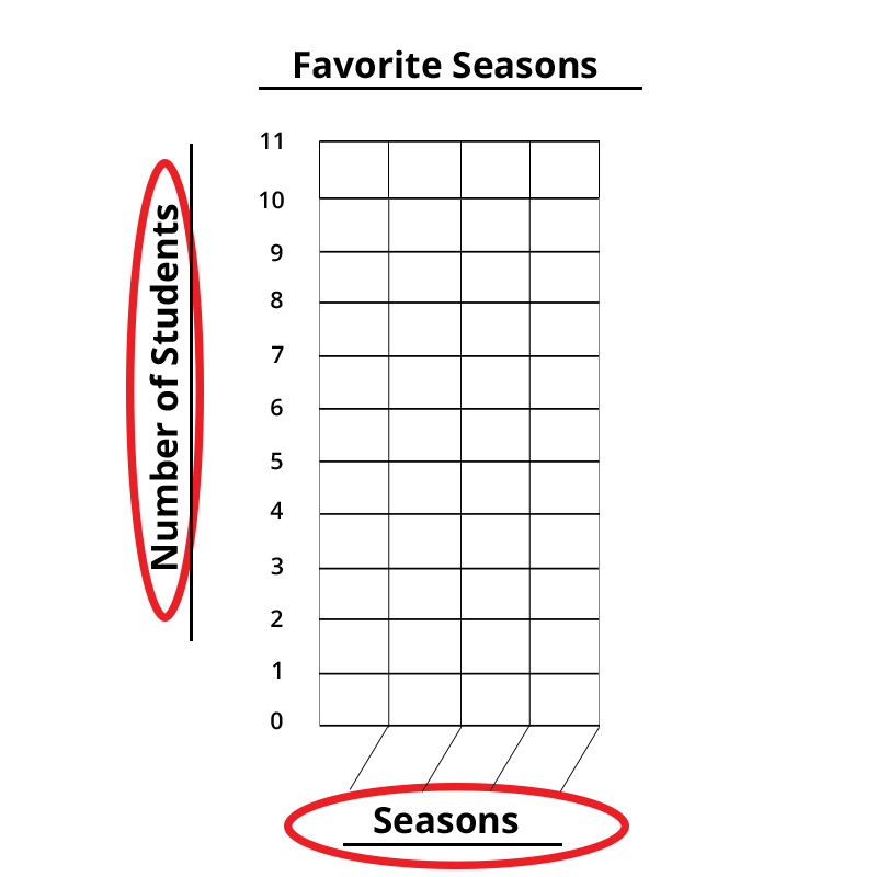
Now write the labels at the bottom and the side of the bar graph. Label the bottom as Seasons and the side as Number of Students.
Can you write each season to label the bars on the graph?
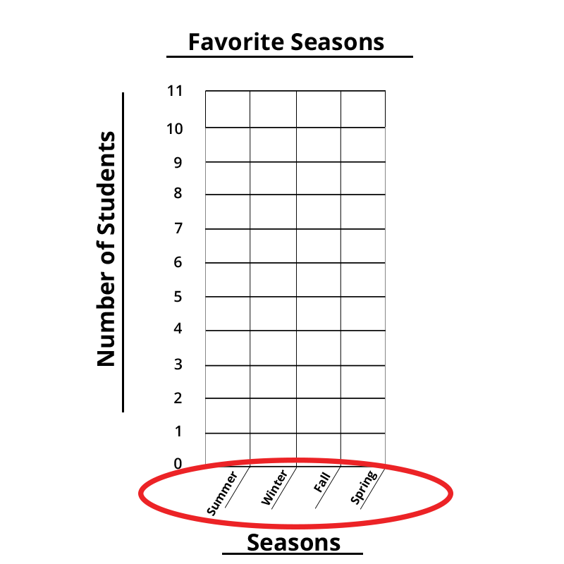
Use the tally chart to draw bars above each season. Use different colors of crayons for each bar.
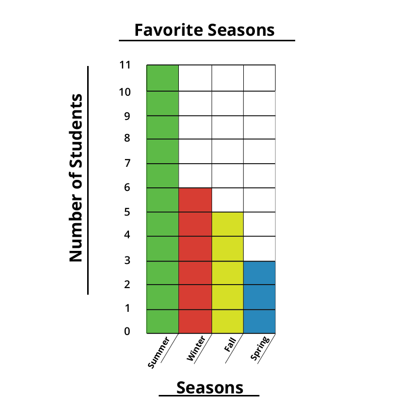
Good job! Your bar graph is complete.
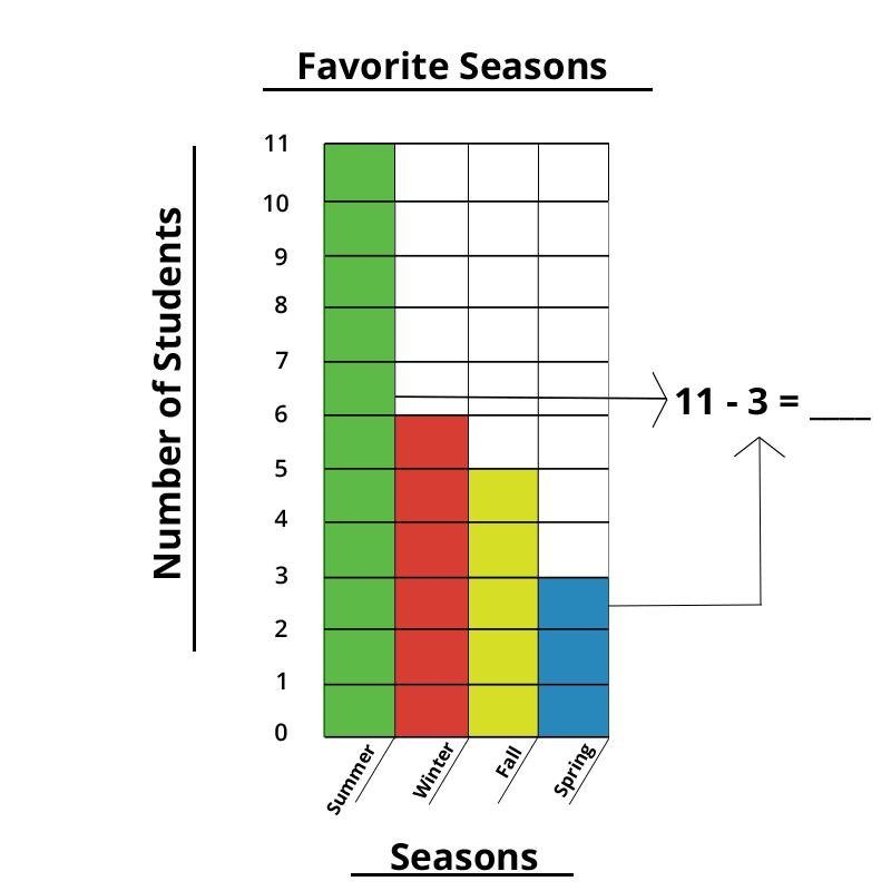
11 people like summer, and 3 people like spring, so 11 - 3 = 8.
Yes! 11 people like summer, and 3 people like spring, so 11 - 3 = 8.
11 people like summer, and 3 people like spring, so 11 - 3 = 8.
Questions answered correctly:
Questions answered incorrectly:
Click the button below to download your worksheet.
Favorite Season Data Collection