How well can you use the strategies of focusing in and ignoring outliers to analyze a non-linear data set using a linear model?
Let's Review
In this lesson, you have learned strategies for analyzing non-linear data using a linear model. Look at this example before doing some practice problems on your own.
In the video at the beginning of this lesson, Shawn was trying to answer the following question.
How does the amount of sleep a person gets each night change as they get older?
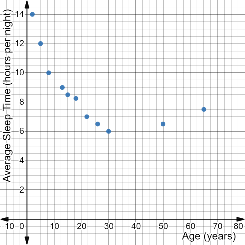
Shawn gathered data comparing age with the amount of sleep people get on average.
Age (years)
2
5
8
13
15
18
22
26
30
50
65
Average Sleep Time (hours per night)
14
12
10
9
8.5
8.25
7
6.5
6
6.5
7.5
Then, he created a scatterplot of the data. The data in the scatterplot shows a non-linear association between the variables.
A non-linear scatter plot with the following attributes:
The x-axis is labeled Age (years).
The y-axis is labeled Average Sleep Time (hours per night).
The following ordered pairs are plotted: (2, 14), (5, 12), (8, 10), (13, 9), (15, 8.5), (18, 8.25), (22, 7), (26, 6.5), (30, 6), (50, 6.5), and (65, 7.5).
How can Shawn use a linear model to analyze this non-linear data and answer his question?
Study the slideshow to see how to first create a linear model for the data by stating a domain or identifying outliers to ignore and then to use the linear model to answer Shawn's question.
To use a linear model to analyze non-linear data, you must find a linear association inside the non-linear association. One strategy is to focus on a specific part of the data that is linear. Another strategy is to ignore any points that are outliers.
Which strategy should Shawn use?
Focusing in allows you to create a linear model that represents a part of the data. Ignoring outliers allow you to create a linear model the represents all the data except for one or two points.
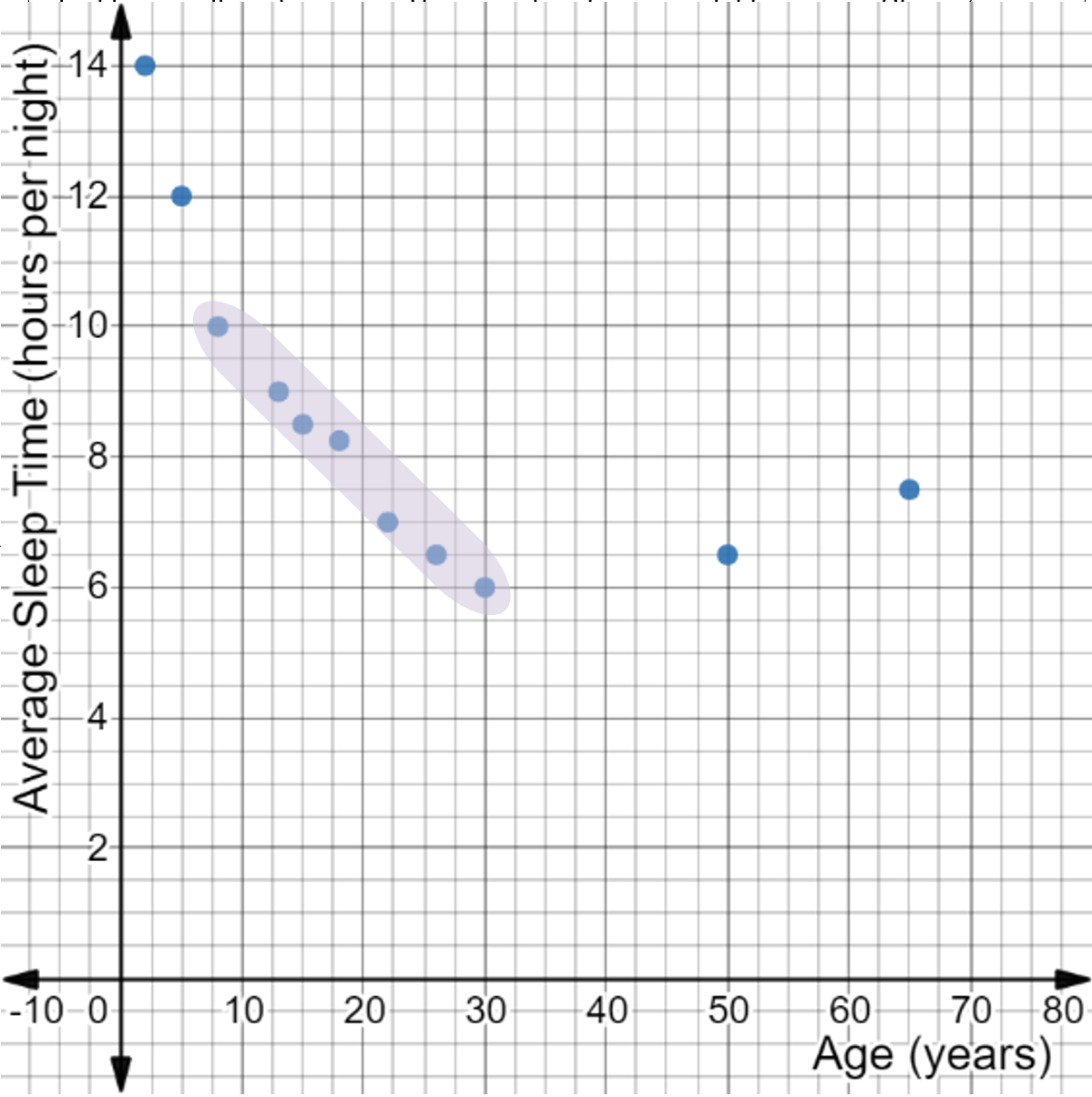
First, examine the scatterplot to see if there is any part of the data that has a linear association. If there is a linear section of the data that can be represented with a straight line, then focusing on a domain is the best strategy to use. If ignoring one or two data points allows the remaining data to be represented by a straight line, then ignoring outliers is the best strategy to use.
A non-linear scatter plot with the following attributes:
The x-axis is labeled Age (years).
The y-axis is labeled Average Sleep Time (hours per night).
The following ordered pairs are plotted: (2, 14), (5, 12), (8, 10), (13, 9), (15, 8.5), (18, 8.25), (22, 7), (26, 6.5), (30, 6), (50, 6.5), and (65, 7.5).
The ordered pairs (8, 10), (13, 9), (15, 8.5), (18, 8.25), (22, 7), (26, 6.5), and (30, 6) are highlighted.
The highlighted portion of the scatterplot shows the most linear portion of the data. There are too many points being excluded to be considered outliers in this case. Since the highlighted portion of the scatterplot represents data that can be modeled by a straight line, Shawn's data can be analyzed using a linear model by focusing on a domain.
The steps for focusing on a portion of the data that can be modeled with a straight line are shown in the table below. Click each step to see how to identify the domain of Shawn's scatterplot that can be analyzed using a linear model.
A non-linear scatter plot with the following attributes:
The x-axis is labeled Age (years).
The y-axis is labeled Average Sleep Time (hours per night).
The following ordered pairs are plotted: (2, 14), (5, 12), (8, 10), (13, 9), (15, 8.5), (18, 8.25), (22, 7), (26, 6.5), (30, 6), (50, 6.5), and (65, 7.5).
The ordered pairs (8, 10), (13, 9), (15, 8.5), (18, 8.25), (22, 7), (26, 6.5), and (30, 6) are highlighted.
The highlighted section of data has a linear association.
There are 7 data points included in the highlighted section. There are 4 points being excluded. Four is less than half the data, so it is acceptable to use the highlighted section for a linear model.
The domain of the highlighted section is based on \( x \)-values of the included data points. The highest and lowest \( x \)-values make the domain. These come from the data points that are farthest right and left in the included section.
The highest \( x \)-value of the included data is 30. The lowest \( x \)-value of the included data is 8.
The domain with a linear association is people of age 8 to 30.
Shawn can create a linear model for the data that represents the average sleep times for people between the ages of 8 and 30.
To make a linear model, Shawn will need to find the line of best fit for the linear data and calculate the equation in slope-intercept form. Then, he will be able to interpret the equation to answer his question.
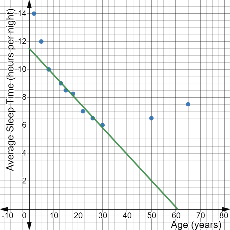
The line of best fit for the data in the domain from age 8 to 30 is shown on the scatterplot below:
A non-linear scatter plot with the following attributes:
The x-axis is labeled Age (years).
The y-axis is labeled Average Sleep Time (hours per night).
The following ordered pairs are plotted: (2, 14), (5, 12), (8, 10), (13, 9), (15, 8.5), (18, 8.25), (22, 7), (26, 6.5), (30, 6), (50, 6.5), and (65, 7.5).
A line of best fit is drawn through the ordered pairs (8, 10), (13, 9), (15, 8.5), (18, 8.25), (22, 7), (26, 6.5), and (30, 6).
The steps for calculating the equation in slope-intercept form of the line of best fit on a scatterplot are shown in the table below. Click each step to see how Shawn used it to create a linear model from the scatterplot.
Shawn chose to use the guide points (8, 10) and (50, 2) to find the slope of the line. He used the slope formula:
The slope is approximately \( - 0.19 \), and the \( y \)-intercept is approximately \( 11.52 \), so the equation of the linear model is \( y = - 0.19x + 11.52 \).
So, the linear model for the relationship between age and amount of sleep for people of ages 8 to 30 is:
\( y = - 0.19x + 11.52. \)
The linear model for the relationship between age and amount of sleep for people of ages 8 to 30 is:
\( y = - 0.19x + 11.52 \)
Use this linear model to answer the following question:
How does the amount of sleep a person gets each night change as they get older?
Shawn wants to know how sleep time changes as people get older. This is a question that asks how the two variables change, which means Shawn should analyze the slope. The slope is \( - \)0.19. The slope is negative, which means as age increases, the amount of sleep decreases. Each year a person ages, they will get 0.19 hours less sleep. To determine what 0.19 hours means, you could multiply by 60 to change hours into minutes.
\( 0.19 \times 60 = 11.4 \)
This means every year between age 8 and 30, a person's average amount of sleep each night will decrease by 11.4 minutes.
Think you got it?
Now it's your turn. Practice using a linear model to work with non-linear data by completing the activity below. Answer the question on each tab, then check your answer.
If you need graph paper, click below to download printable graph paper in Word or PDF format.
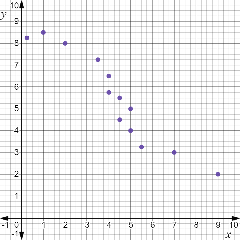
Identify the domain on the following scatterplot that can be analyzed using a linear model.
A non-linear scatter plot with the ordered pairs (0.25, 8.25), (1, 8.5), (2, 8), (3.5, 7.25), (4, 6.5), (4, 5.75), (4.5, 4.5), (4.5, 5.5), (5, 4), (5, 5), (5.5, 3.25), (7, 3), and (9, 2).
The domain that can be analyzed with a linear model includes \( x \)-values from 3.5 to 5.5.
If you need help arriving at this answer, click the Solution button.
Step 1: Look for a section of data on the scatterplot with a linear association.
The shaded portion of the data below is the most linear portion of the data.
A non-linear scatter plot with the ordered pairs (0.25, 8.25), (1, 8.5), (2, 8), (3.5, 7.25), (4, 6.5), (4, 5.75), (4.5, 4.5), (4.5, 5.5), (5, 4), (5, 5), (5.5, 3.25), (7, 3), and (9, 2). The ordered pairs (3.5, 7.25), (4, 6.5), (4, 5.75), (4.5, 4.5), (4.5, 5.5), (5, 4), (5, 5), and (5.5, 3.25) are highlighted.
Step 2: Check that less than half the data is being excluded.
There are 8 data points included in the highlighted section. There are 5 points being excluded. Five is less than half the data, so it is acceptable to use the highlighted section for a linear model.
Step 3: Identify and state the domain that has a linear association using the largest and smallest \( x \)-values of the linear data.
The domain of the highlighted section is based on \( x \)-values of the included data points. The highest and lowest \( x \)-values make the domain. These come from the data points that are farthest right and left in the included section.
The highest \( x \)-value of the included data is 5.5. The lowest \( x \)-value of the included data is 3.5.
The domain with a linear association is from 3.5 to 5.5.
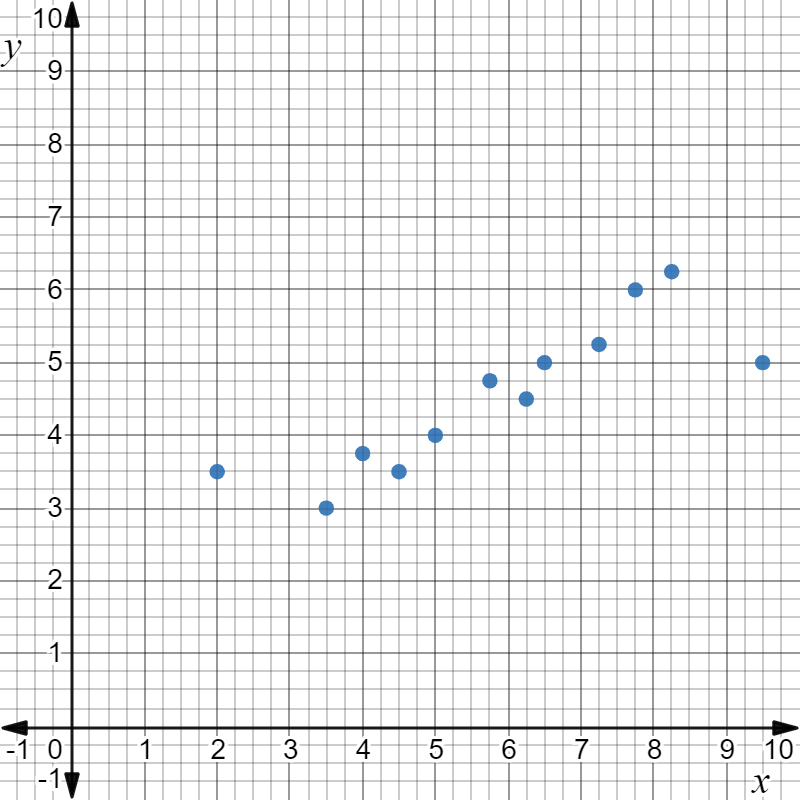
On the following scatterplot, identify outliers that can be ignored to allow analysis with a linear model.
A non-linear scatter plot with the ordered pairs (2, 3.5), (3.5, 3), (4, 3.75), (4.5, 3.5), (5, 4), (5.75, 4.75), (6.25, 4.5), (6.5, 5), (7.25, 5.25), (7.75, 6), (8.25, 6.25), and (9.5, 5).
The outliers (2, 3.5) and (9.5, 5) can be ignored while creating a linear model for the data.
If you need help arriving at this answer, click the Solution button.
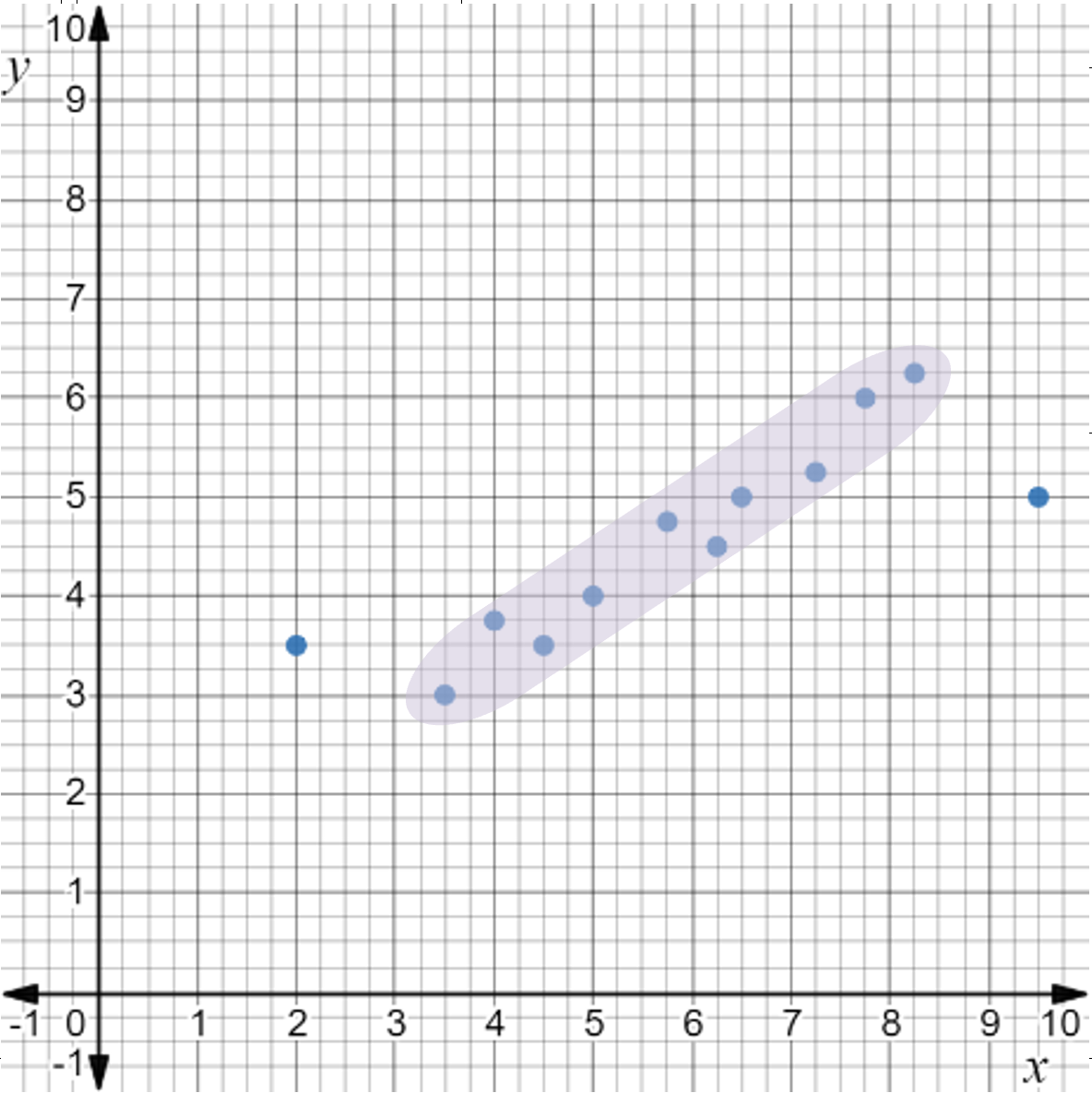
Step 1: Look for part of the association that could be linear.
The highlighted portion of the data shows a linear association.
A non-linear scatter plot with the ordered pairs (2, 3.5), (3.5, 3), (4, 3.75), (4.5, 3.5), (5, 4), (5.75, 4.75), (6.25, 4.5), (6.5, 5), (7.25, 5.25), (7.75, 6), (8.25, 6.25), and (9.5, 5). The ordered pairs (3.5, 3), (4, 3.75), (4.5, 3.5), (5, 4), (5.75, 4.75), (6.25, 4.5), (6.5, 5), (7.25, 5.25), (7.75, 6), and (8.25, 6.25) are highlighted.
Step 2: Make sure only one or two points are ignored as possible outliers.
There are only two points that are possible outliers. This is an acceptable number of outliers to ignore while creating a linear model.
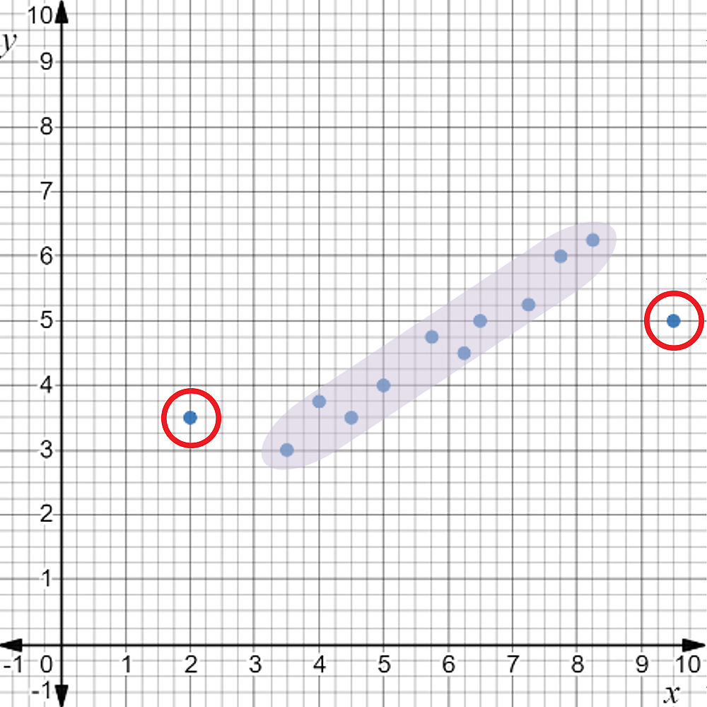
Step 3: Identify the outlier points that will be ignored by their coordinate pairs.
A non-linear scatter plot with the ordered pairs (2, 3.5), (3.5, 3), (4, 3.75), (4.5, 3.5), (5, 4), (5.75, 4.75), (6.25, 4.5), (6.5, 5), (7.25, 5.25), (7.75, 6), (8.25, 6.25), and (9.5, 5). The ordered pairs (3.5, 3), (4, 3.75), (4.5, 3.5), (5, 4), (5.75, 4.75), (6.25, 4.5), (6.5, 5), (7.25, 5.25), (7.75, 6), and (8.25, 6.25) are highlighted and the ordered pairs (2, 3.5) and (9.5, 5) are circled.
The two outlier points are (2, 3.5) and (9.5, 5).
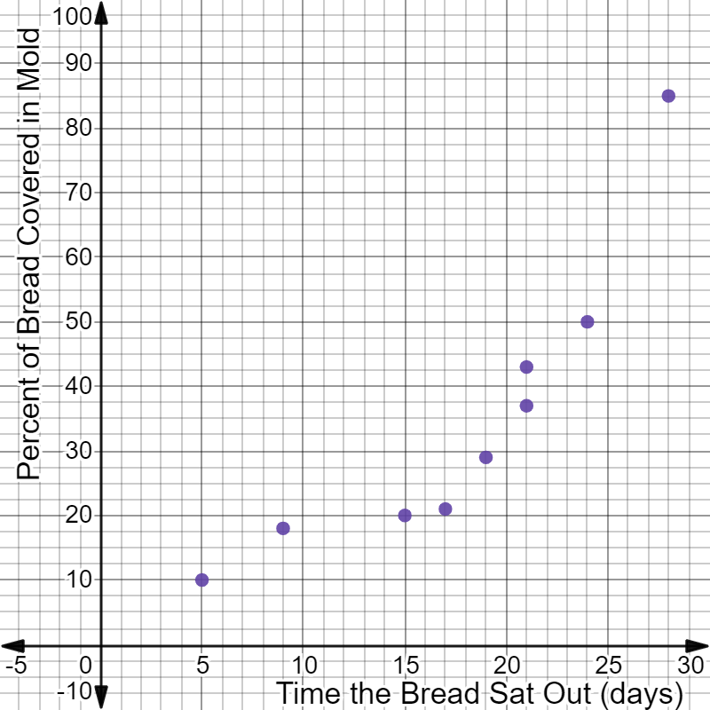
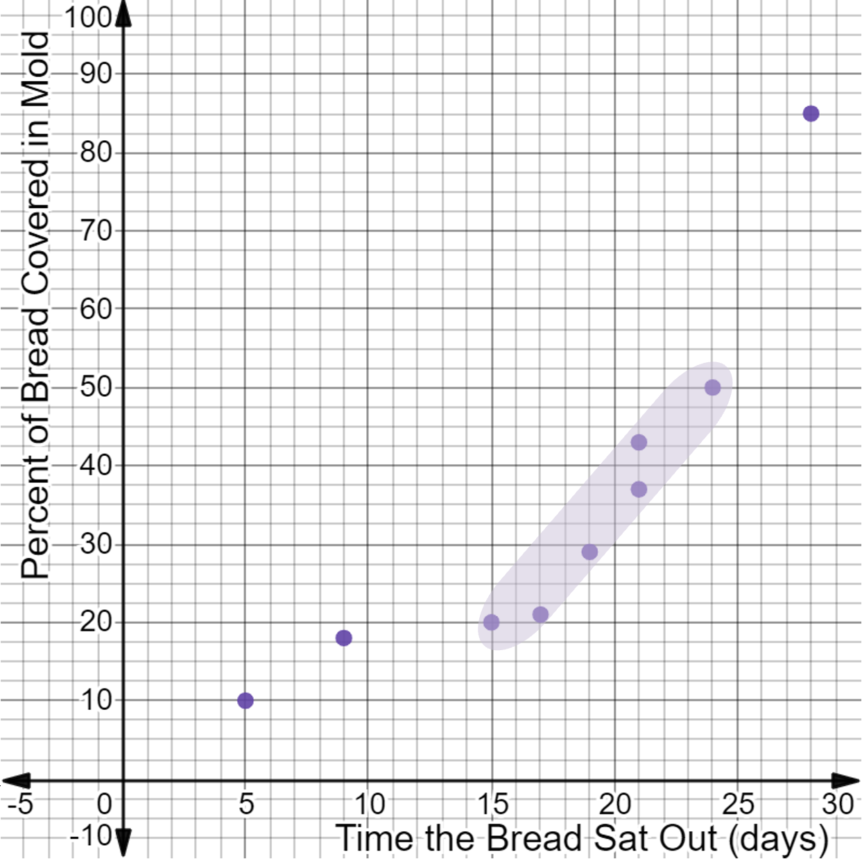
The data in the table shows the percent of a slice of bread that is covered in mold compared to how long the bread had been sitting out.
Time the Bread Sat Out (days)
5
9
15
21
19
17
21
24
28
Percent of Bread Covered in Mold
10
18
20
37
29
21
43
50
85
Create a scatterplot to visualize the data. If the association is non-linear, identify either the domain that can be used or the outliers that can be ignored. Then, find the equation of a linear model for the data.
The data has a linear association for the domain from 15 to 24.
The equation of the linear model for the domain from 15 to 24 is:
\( y = 3.57x - 36.41 \)
If you need help arriving at this answer, click the Solution button.
The data is shown on the scatterplot below:
A non-linear scatter plot with the following attributes:
The x-axis labeled Time the Bread Sat Out (days).
The y-axis labeled Percent of Bread Covered in Mold.
The ordered pairs (5, 10), (9, 18), (15, 20), (21, 37), (19, 29), (17, 21), (21, 43), (24, 50), and (28, 85) are plotted.
The association is non-linear, but there is a linear portion of the data, which appears as if it could be analyzed by focusing on a domain.
Step 1: Look for a section of data on the scatterplot with a linear association.
A non-linear scatter plot with the following attributes:
The x-axis labeled Time the Bread Sat Out (days).
The y-axis labeled Percent of Bread Covered in Mold.
The ordered pairs (5, 10), (9, 18), (15, 20), (21, 37), (19, 29), (17, 21), (21, 43), (24, 50), and (28, 85) are plotted.
The ordered pairs (15, 20), (21, 37), (19, 29), (17, 21), (21, 43), and (24, 50) are highlighted.
The shaded portion of the data has a linear association.
Step 2: Check that less than half the data is being excluded.
There are 6 data points included in the highlighted section. There are 3 points being excluded. Three is less than half the data, so it is acceptable to use the highlighted section for a linear model.
Step 3: Identify and state the domain that has a linear association using the largest and smallest \( x \)-values of the linear data.
The domain of the highlighted section is based on \( x \)-values of the included data points. The highest and lowest \( x \)-values make the domain. These come from the data points that are farthest right and left in the included section.
The highest \( x \)-value of the included data is 24. The lowest \( x \)-value of the included data is 15.
The domain with a linear association is from 15 to 24.
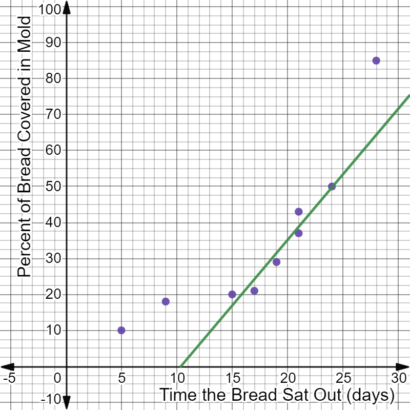
The linear model for the domain from 15 to 24 is shown on the scatterplot below:
A non-linear scatter plot with the following attributes:
The x-axis labeled Time the Bread Sat Out (days).
The y-axis labeled Percent of Bread Covered in Mold.
The ordered pairs (5, 10), (9, 18), (15, 20), (21, 37), (19, 29), (17, 21), (21, 43), (24, 50), and (28, 85) are plotted.
A line of best fit is drawn through the ordered pairs (15, 20), (21, 37), (19, 29), (17, 21), (21, 43), and (24, 50.
Your line may be slightly different from the one shown but should be centered and balanced on the data. Check your line using the distance method.
Use the steps below to calculate the equation in slope-intercept form of the line of best fit shown on the scatterplot.
Step 1: Choose two points on the line, and calculate the slope using the slope formula.
The guide points (13, 10) and (20, 35) are used here.
The \( y \)-intercept is not visible on the graph, so it is calculated using the guide point (13, 10) and the slope in the slope-intercept form equation.
Step 3: Write the final equation in slope-intercept form.
The equation of the linear model for the domain from 15 to 24 is:
\( y = 3.57x - 36.41 \)
Text
Guided Notes
Tutor
Video
How To
Meet your new study partner! With our powerful Student Tools, your online learning experience just got more accessible,
personalized, and thought-provoking than ever before!
Do you feel like you learn better when you watch videos? You’re not alone!
Research shows instructional videos can make learners more engaged and active in online classes,
when compared to text-only lessons.
Student Tools lets you turn some lesson pages into videos instantly! Just click the Student Tools tab and select Video.
Remember, video instruction is not available on every lesson page.
Go back to the lesson page any time by closing the Student Tools window.
Sometimes when you learn, it can feel like you’re just not getting it. Maybe you don’t really know what all the words on
the page mean, or you have to read a paragraph two or three times to understand what it’s about.
If this happens to you, just click the Student Tools tab and choose “Text.” This will automatically
simplify the instruction, making it easier to understand and remember.
Go back to the lesson page any time by closing the Student Tools window.
The science is in, and taking notes is one of the best ways to reinforce your learning.
Notes work even better when you write them by hand, since you’re more likely to put complex new ideas
in your own words and remember them longer.
You can quickly and easily access guided notes, as well as key lesson vocabulary,
by clicking Student Tools > Notes. Choose a PDF or Word Doc,
and fill them out online -- or even better-- print them out and take notes by hand!
Go back to the lesson page any time by closing the Student Tools window.
Imagine a teacher you can contact anytime, who is happy to answer all your questions and
knows pretty much everything in the world about the subject you need help with.
Say, “Hello!” to your Tutor! Click on Student Tools > Tutor, and ask any question about your class.
Your Tutor is super smart! You can ask the Tutor to explain things more clearly, make connections
between ideas, or even give you custom quizzes and feedback. You can click the links under References to learn more.
Go back to the lesson page any time by closing the Student Tools window.
Student Tools lets you create your own Flashcard decks to help you study. To get started, click Student Tools >
Flashcards. Press Add New Set and give it a title.
Now, decide what will be on the front and back of your first card. It can be a term and definition, a challenging question,
or even a funny phrase that helps you remember something. Click Add Card to Set to make a new Flashcard.
You can delete sets or cards by clicking the trash can icon. When you’re done, click Save Cards to Set.
Now you can Review your deck. Read the front of the card, and think of the answer. Even better, say your answer out loud! Then, click the card to flip it over.
Depending on how you did, you can either keep that card in the deck to study again by clicking Next or Previous, or if you got it right, click remove.
Remember to review your flashcards often, space out study sessions, and keep practicing until you know them all!
Go back to the lesson page any time by closing the Student Tools window.