So far, you've learned about grid-container properties, but what about grid cells and grid items? Like Flexbox layouts, containers and items have their own unique properties to enhance and customize the layout of the grid. Click through the tabs below to learn more about what properties can be applied to grid items.

As you've learned, a grid container houses grid items. By default, a grid will place one grid item per grid row, unless we explicitly tell it otherwise. When it comes to sizing and placing individual grid items, we use the following properties.
| Column | Row |
|---|---|
| grid-column-start | row-column-start |
| grid-column-end | row-column-end |
Each property will accept one of the three values.
- auto: This sets the grid item to default to any size explicitly outlined by the parent grid container.
- grid line number: This sets the grid item to start on a designated line number.
- span: This tells the grid item how many columns or rows the item should occupy.
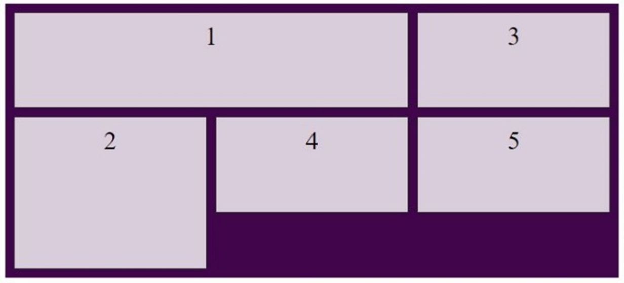
Let's look at a familiar example...
This is a grid layout from the previous page. We can see that grid item number 3 spans two columns and that grid item number 5 spans two rows.
<style>
  .grid-container {
    display: grid;
    grid-template-columns: auto auto auto;
    grid-template-rows: auto auto;
    grid-auto-flow: column dense;
    height: 150px;
    padding: 10px;
    background-color: #40054a;
  }
  .grid-container div {
    background-color: rgba(255, 255, 255, 0.8);
    border: 1px solid rgba(0, 0, 0, 0.8);
    padding: 10px 0;
    font-size: 1.2em;
    text-align: center;
  }
  .item3 {
    grid-column-start: auto;
    grid-column-end: span 2;
  }
  .item5 {
    grid-row-start: auto;
    grid-row-end: span 2;
    }
</style>

<section class="grid-container">
  <div class="item1">1</div>
  <div class="item2">2</div>
  <div class="item3">3</div>
  <div class="item4">4</div>
  <div class="item5">5</div>
  <div class="item6">6</div>
</section>
Let’s look at a few more examples. Look at the images below and see if you can determine what properties and values were used. Click on the images to see the code snippets for each property.


Another way to lay out your grid items is using the grid-template-areas and the grid-area properties. The grid-template-areas property is a grid-container property that uses the grid-item property grid-area to structurally visualize our desired layout.
Click through the slideshow below to see the grid-template-areas property in action and how to use the grid-area property to accomplish it.
Let's use the following layout as an example. This is a basic web page layout that contains a header, footer, navigation, and a main content area.

When establishing this layout, you first need to know how much space you would like each element to occupy. This will help you set up your grid structure. For this example, a 6-column grid is being used.

If you break down this layout, you can see the following:
- The header occupies all 6 columns.
- The navigation occupies 2 columns.
- The main content occupies 4 columns.
- The footer occupies 4 columns with 1 empty column on each side.
To make this grid layout, you need to first establish the grid container, then create the 4 grid items in HTML, and finally assign a grid-area name to each grid item, using the grid-area property.
When assigning a grid-area item name value, you should keep the naming conventions as semantic (meaningful) as possible. This will not only help you stay organized but will help others you may be collaborating with to understand your code. In this example, an abbreviation for each section is given.
<style>
  section.grid-container {
    display: grid;
    gap: 10px;
  }
  div.grid-item1 {
    grid-area: hd; /*header*/
  }
  div.grid-item2 {
    grid-area: nv; /*navigation*/
  }
  div.grid-item3 {
    grid-area: mn; /*main content*/
  }
  div.grid-item4 {
    grid-area: ft; /*footer*/
  }
</style>

<section class="grid-container">
  <div class="grid-item1">Header</div>
  <div class="grid-item2">Navigation</div>
  <div class="grid-item3">Main Content</div>
  <div class="grid-item4">Footer</div>
</section>
Next, within the grid-container property, you use grid-template-columns to establish your 6-column grid. (Remember, the number of values = the number of columns.)
<style>
  section.grid-container {
    display: grid;
    gap: 10px;
    grid-template-columns: repeat(6, 1fr);
  }
</style>
Once your 6 columns are set, you can then use the grid-template-areas attribute to place the page elements, using the grid-area name values that were just assigned.
- You know that the header will occupy all 6 columns, so you place that value 6 times, once for each column.
- Beneath the header, you have the navigation in two columns and the main content in 4 columns.
- Finally, you have the footer, which spans 4 columns and has a blank column on either side. Blank columns can be represented with a ''.'' symbol. (See below.)
<style>
  section.grid-container {
    /*...previous styling...*/
    grid-template-areas:
      'hd hd hd hd hd hd'
      'nv nv mn mn mn mn'
      '.  ft ft ft ft .'
    ;
  }
</style>
As you can see, the grid-template-areas values look very similar to the desired page layout!
<style>
  section.grid-container {
    display: grid;
    gap: 10px;
    grid-template-columns: repeat(6, 1fr);
    grid-template-areas:
      'hd hd hd hd hd hd'
      'nv nv mn mn mn mn'
      '.  ft ft ft ft .'
    ;
  }
</style>
You Try!
Using your own text editor or the coding space below, test your skills on the properties we just learned! Practice different layouts and configurations and see what is and isn't possible. Try combining the grid-template-areas property, grid-area property, and the grid-row-start/stop properties and see what happens! When you think you've got the hang of it, move on to the next page in this lesson.
