How do you use the elements and principles when talking about art?
Now that you recall the elements and principles, let’s use them to to recognize styles of art and to create a personal aesthetic statement. Look at the pieces of art on the following slides. For each slide, answer these questions in your sketchbook:
What are some similarities that you notice between the artworks?
What are some differences?
How do the artists use the elements and principles in their art?
(For example: Where do you see color, and how is it used? What kind of balance exists in each work?)
The Star by Edgar Degas and Peasant Women Planting Stakes by Camille Pissarro, Impressionist
The Impressionists were fascinated by light and its impact on a visual scene. They tended to use bright colors in their scenes of everyday life. Degas and Pissarro both use color, but Degas’ work is slightly more muted than Pissarro’s. Both artists use repetition in line and the positions of the bodies to show movement and to create visual rhythm. Pissarro uses a more formal, symmetrical balance, while Degas uses asymmetrical balance to create a contrast between the main dancer and the background dancers. Both artworks use a great deal of texture and value to create visual interest throughout.
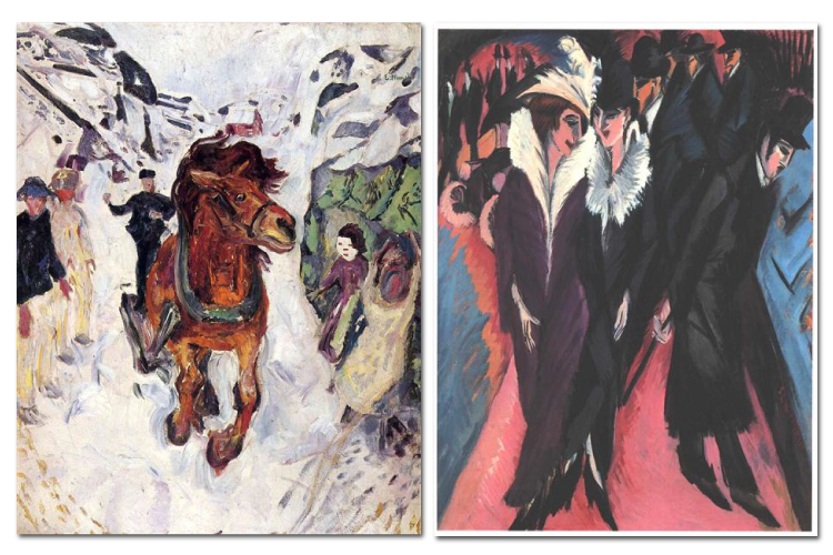
Galloping Horse by Edvard Munch and Street, Berlin by Ernst Ludwig Kirchner, Expressionist
Expressionist artists wanted to use their art to express emotion or mood. In these examples by Munch and Kirchner, the artists both use shallow space to make their artwork appear cramped. They also use a contrast of dark and light colors to create emphasis on their focal point. Kirchner uses repetition of pattern and shape to create a visual rhythm and movement in his artwork, while Munch uses lines and shapes that create a perspective movement toward the galloping horse. Munch also uses contrast in scale between the horse and the people to create emphasis and to accentuate the horse’s power. Both artists use the formal (or symmetrical) balance in their artwork to keep the emphasis on their focal points.
Mona Lisa by Leonardo DaVinci and Mary with the Child and Saints by Titian, High Renaissance
Artists of the Renaissance were very interested in the art of ancient Greece and Rome, and therefore, tried to create realistic artwork. Both da Vinci and Titian use a large value range in their artwork to depict the folds in the fabric. They also use value to contrast the subjects’ light faces and their dark clothes; this creates a focal point. Both artists use formal balance and a contrast in texture between the people and the background. Da Vinci suggests more space in his piece because the background is more visible, while Titian squeezes his subjects into the canvas.
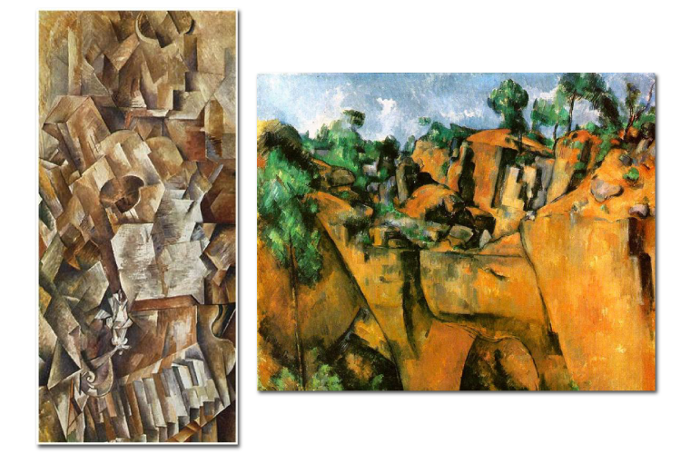
Piano and Mandolin by Georges Braque and Bibemus Quarry by Paul Cezanne, Cubism
Cubist artists wanted to deconstruct their subjects to create visual movement through rhythm and repetition. In these artworks, Braque and Cezanne both use repeating shapes to help guide the viewer’s eye, but Braque uses more geometric shapes while Cezanne’s are more organic. Braque also creates more visual rhythm throughout his work to mirror the fact that its subjects are musical instruments. Cezanne’s brighter colors make it obvious that he is creating a landscape, and Braque’s darker, muted colors suited to his indoor still life. Both artists use a lot of lines, but Cezanne uses more variations in line weight. The artists also differ in their use of space; Cezanne uses deep shadow and stark contrast to suggest a vast outdoor space, while Braque uses less contrast to suggest a very shallow space. Both artists use a wide range of values and lots of texture to add visual interest to their artwork.
Text
Guided Notes
Tutor
Video
How To
Meet your new study partner! With our powerful Student Tools, your online learning experience just got more accessible,
personalized, and thought-provoking than ever before!
Do you feel like you learn better when you watch videos? You’re not alone!
Research shows instructional videos can make learners more engaged and active in online classes,
when compared to text-only lessons.
Student Tools lets you turn some lesson pages into videos instantly! Just click the Student Tools tab and select Video.
Remember, video instruction is not available on every lesson page.
Go back to the lesson page any time by closing the Student Tools window.
Sometimes when you learn, it can feel like you’re just not getting it. Maybe you don’t really know what all the words on
the page mean, or you have to read a paragraph two or three times to understand what it’s about.
If this happens to you, just click the Student Tools tab and choose “Text.” This will automatically
simplify the instruction, making it easier to understand and remember.
Go back to the lesson page any time by closing the Student Tools window.
The science is in, and taking notes is one of the best ways to reinforce your learning.
Notes work even better when you write them by hand, since you’re more likely to put complex new ideas
in your own words and remember them longer.
You can quickly and easily access guided notes, as well as key lesson vocabulary,
by clicking Student Tools > Notes. Choose a PDF or Word Doc,
and fill them out online -- or even better-- print them out and take notes by hand!
Go back to the lesson page any time by closing the Student Tools window.
Imagine a teacher you can contact anytime, who is happy to answer all your questions and
knows pretty much everything in the world about the subject you need help with.
Say, “Hello!” to your Tutor! Click on Student Tools > Tutor, and ask any question about your class.
Your Tutor is super smart! You can ask the Tutor to explain things more clearly, make connections
between ideas, or even give you custom quizzes and feedback. You can click the links under References to learn more.
Go back to the lesson page any time by closing the Student Tools window.
Student Tools lets you create your own Flashcard decks to help you study. To get started, click Student Tools >
Flashcards. Press Add New Set and give it a title.
Now, decide what will be on the front and back of your first card. It can be a term and definition, a challenging question,
or even a funny phrase that helps you remember something. Click Add Card to Set to make a new Flashcard.
You can delete sets or cards by clicking the trash can icon. When you’re done, click Save Cards to Set.
Now you can Review your deck. Read the front of the card, and think of the answer. Even better, say your answer out loud! Then, click the card to flip it over.
Depending on how you did, you can either keep that card in the deck to study again by clicking Next or Previous, or if you got it right, click remove.
Remember to review your flashcards often, space out study sessions, and keep practicing until you know them all!
Go back to the lesson page any time by closing the Student Tools window.