 For a project in Statistics you want to know if there is a relationship between the age and height of students.
You decide to concentrate on the elementary schools since there is the greatest range of ages and you narrow your research to just the girls. The following is the data that you collected:
| Girl's Age | 6 | 7 | 8 | 9 | 10 | 11 | 12 |
| Height (inches) | 44 | 50 | 52 | 51 | 53 | 58 | 60 |
Given the data table above, construct a scatter plot showing the data in the table. Make sure to label all axes.
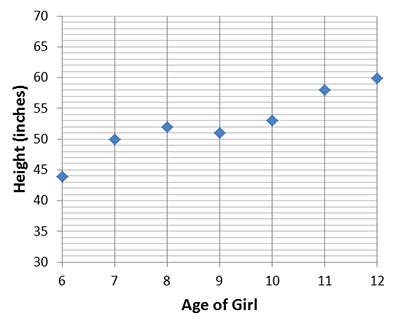
Discuss the trends that you see in the data. Check the reveal to see if your observations are correct.
The best-fit line for this data is a straight line that is drawn through the middle of the points on the graph (shown on the left). The line splits the difference so there are about as many dots above the line as there are below the line. Another student drew the best-fit line shown here on the right for the
same graph. This is not a good best-fit line because the line is too
far above the first point and too far below the last two points. It needs to be drawn so that there are equal dots (points) above and below the line.
 |
 |
Click the images to see a larger view |
|
