Due to the nature of its flow and layout, HTML and CSS almost always create a grid with sharp edges and corners, which looks quite boxy. This design appearance doesn't always complement a web page's subject matter. Curvy borders can look more playful, organic, retro or whimsical. Achieving this look was previously only possible by creating an image of a curved border. But as of CSS3, we can use the border-radius property to curve the corners of a container's border.
The border-radius essentially changes a container's corners into arcs. The property's value is how far in (horizontally and vertically) away from the corner the radii will originate. From this point, invisible lines are drawn out to the container's edges, and an arc is drawn between them. This number value can be done in unit lengths or percentages.

One value set for border-radius applies the same value to all four corners. Four values will apply them in the order of top-left, top-right, bottom-right, and bottom-left. If you use two values, they will be applied as top-left/bottom-right and top-right/bottom-left. These can also be set with individual properties:
| border-radius-top-left | border-radius-top-right |
| border-radius-bottom-right | border-radius-bottom-left |
|
<style> |
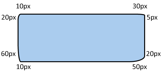
If you want to get even more particular with the curves, you can split the measurements that are applied to the corners. You can separate the corner measurements into two groupings separated by a forward slash "/". The first grouping represents the sides of the corners that face up or down. The second value group represents the corner halves that face out to the left or right.
|
<style> |
|
