You have seen how charts, graphs, and maps can help us understand events in the distant past. These visual tools also help people in a wide range of careers solve the mysteries of today. Modern maps have shown why certain animals are in danger of becoming extinct, how climate change is affecting the weather, and where important resources like oil and copper can be found. Today's maps can even track hurricanes, tsunamis, wildfires, and earthquakes, helping us stay ahead of the forces of nature.
One of the first people to unlock the life-saving power of cartography
was a surgeon named John Snow, who used maps to change the way his local
government thought about the Blue Death, a terrible disease sweeping
through parts of London in 1831.
A Mysterious Disease

In 19th-century Britain, people suddenly began dying from a new and strange disease, and no one knew why. The disease claimed the lives of 32,000 people, who would often die within hours of becoming ill. The leading scientists of the time thought that the disease was spread through "bad air."
Dr. Snow's Theory

However, a young doctor named John Snow believed that very small organisms in polluted water were the real cause of the disease. Despite evidence that all of the victims had been exposed to raw sewage in their water, no one took Snow's theory seriously.
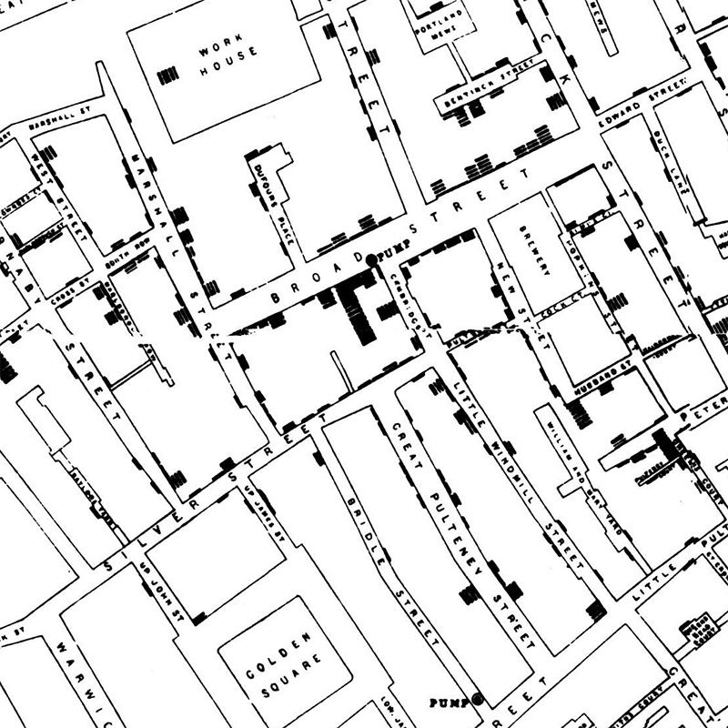
Mapping Disease

To support his claim, Snow turned to maps. He began to mark every death from the disease on a map of the city, and found a remarkable pattern. Certain public water pumps were connected to high rates of infection. When Snow tested these water pumps, he found they were all contaminated with sewage.
Maps to the Rescue

Scientists soon discovered that Dr. Snow was right: The disease (called cholera) was caused by a microscopic bacteria that lived in polluted water, and it could easily be stopped in its tracks by making sure that drinking water was clean. John Snow's careful observation and creative map-making had saved thousands of lives.
Here is the actual map Dr. Snow created to analyze the deaths on Broad Street. Each black bar represents the location of a death from cholera.
Question
What conclusion can you draw from studying the data in Dr. Snow's map of cholera deaths on Broad Street?
