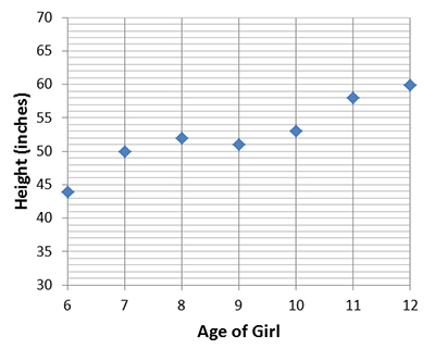
Let's go back to the scatter plot of the student age vs. height data.
Given the data set, how can we determine whether a line is the best-fit for the data? In the video below, you'll learn how a residual plot can be used to assess whether a line is the best-fit for a data set.
To find the residual plot, we’re going to be using our age versus height data that we used in the previous video because we already have our line equation done for this one so it makes it a little easier.
So, what we have to do, is after you have your line of best fit equation we’re going to use this equation to find our new y value, y values that would be on that line based on our exes that are given. So what we would do is we would take six and plug it in to our equation for our x and so we would do two point five times six plus thirty which would give us forty-five.
So what I want you to do right now is I want you to pause the video – I want you to fill in the rest of the new y values column. When you’re done, go ahead and start the video again and we’ll talk about that last column here.
Ok, now that you have your values plugged in, let’s check them with mine. You should all have, forty five, forty-seven point five, fifty, fifty-two point five, fifty –five, fifty-seven point five and sixty.
So what we’re going to do with this next column is we’re going to take our normal y values and subtract from them our new, our residual y values to get different numbers. If you get negative, that’s ok. So for instance, forty-four minus forty-five does give us a negative one. So again, here, please pause the video and then come back when you have the rest of this column filled out.
Now that you have this column filled out, let’s check it with my answers. We should have negative one, two point five, two, negative one point five, negative two, point five and zero.
So, what can we do with that? We can make a graph. Here is how our graph is going to be set up. Our y axis is going to be this new value, these residual values and our x values are going to stay the same. So here I have six through twelve, because those are our x. Our residual values went everywhere from point five all the way up to two point five on the positive and negative point five down to negative two point five.
So if you need to take a second, pause the video and we will start when you get back.
So what we’re going to do is we’re just going to plot all these new points. So I’m going to plot, what happens with six and the residual value, negative one. Seven and two point five. Eight and two. Nine and negative one point five. Ten and negative two. Eleven and point five. Twelve and zero.
So when I look at our residual plot, and when we’re dealing with linear equations, these points, these dots here should again be all scattered between the top and the bottom. It shouldn’t make any kind of like U –shape or any other shape. It should just be a scattered points on both sides of the X axis. So up here and down here. That tells you that you have a good line of best fit for the data.
