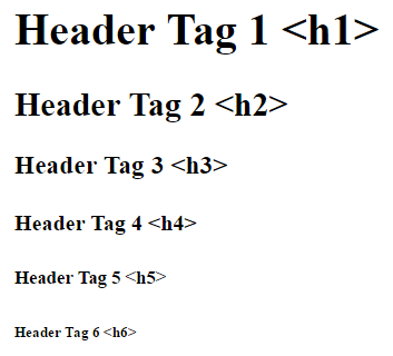
Header tags, also known as heading tags or head tags, are the main tools in building your content’s hierarchy. There are six total to work with, and they are represented by the tags <h1>, <h2>, <h3>, <h4>, <h5>, and <h6>. They are prominently used to contain titles or headlines, or similar important content that should be differentiated from the rest of the page’s text in a pronounced fashion.

Ideally, the <h1> tag is thought of as the all-encompassing title or heading that describes most of the page. Therefore, there should only be one of these on a page, even though multiple are technically allowed. Each subcategory of content, or step lower in a section’s importance, should be represented by the next number of header tag.
Think of using header tags like writing an outline. In an outline, any sub-topics that fall under the main topic will be indented and labeled as the next category down. But in web design, any titles that fall under the main topic (<h1>) will be indicated as <h2>. In the same pattern, sub-categories under an <h2> topic will be labeled as <h3>, and so on, going down one level at a time.
|
<h1>I. Main headline</h1> <h2>1. Subcategory</h2> <h3>a. Sub-subcategory</h3> |
Header tags come built with default font sizes and font weights (how bold they are), with <h1> being the largest and boldest. Each one also adds space above and below itself to better stand out from other text. However, this doesn’t mean that header tags should be applied to text only to apply these characteristics. The main purpose of using header tags is for semantics, not styling. Header tags should be reserved for holding different levels of important information. This helps your readers by organizing your content logically.
And as an added bonus, search engines may take notice of content contained in header tags. So using these tags appropriately can even positively influence web traffic to your site.
