The regular border property lets you use different types of lines of varying thicknesses and colors. But as of CSS3, the border-image property is available as an alternative. This property lets you assign an image that will be divided up to use as a container's border. To understand how border-image operates, click through the slideshow below.
|
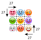
Border-image takes the image you give it and splits into up into nine sections, including four corners, four side sections, and the middle.
The four corner divisions will be taken as used as the corners of your container. No matter how tall or wide your container is, these corners will be unaffected.
The sides are a different story. As there is a good chance the side slices won't be as long or tall as your container, you can choose how this property will fill in the entire sides.
The last section left over, the middle, is actually hidden by default, as the property assumes the main reason you're using it is to decorate the edges of your container, not the inside. However, the keyword "fill" will keep this piece, but more on that below. |
 |
 The Dividing Grid
 Corners
 Side Sections
 The Middle
As far as the values to use, there are really three pieces that you should pay attention to. First, you must establish the image file's location. This uses the sub-property border-image-source. Like with other properties, this is done using url(file location).
border-image-source:url(filename.jpg);
Next, you need to tell the border how far into your image it'll draw each line of the dividing grid. This can take up to four number values, going in the order of top, right, bottom, left. If you have two values, it'll interpret them as top&bottom, left&right. And giving only one value would make it apply to all four sides. This step is done with the sub-property border-image-slice. This is also the section where you can add the keyword fill to prevent the middle section from being removed. You can place "fill" anywhere among the slice number values.
Setting up the area of a border image is a bit quirky. First, you need to also have a declaration for setting up the border itself. Without a border established, a border image can't be placed. The easiest way to set this up, is use the border property shorthand, and establish a solid border of any color, and set its thickness to the same value you'll use for border-image-slice. Note, in the border property, the thickness value takes on the "px" unit, but the border-image-slice property does not.
border-width:solid 27px #000;
border-image-slice: 27;
Finally, you may add the sub-property border-image-repeat to tell border-image how it should handle the border sides. Using a value of "repeat" will simply repeat the side section slices to fill in the length and height of the container. The value "round" will do the same as repeat, except it will resize the slices so that the repeating image slice fits in evenly and isn't cut off at the ends. You can also choose "stretch" which will take one instance of the side slice and stretch it out over the whole span of the container's sides.
| repeat | round | stretch |
You can also take a shorthand approach to this property. Instead of using those three sub-properties separately, you can put all three values into the border-image property itself. This is demonstrated in the code example below.
|
<style> |
