The use of eye catching visuals is usually the main factor in the success of a book cover design. It is what draws readers in and grabs their attention from afar; but a successful use of typography on a cover is what will make interested readers continue and purchase the book. It will tell the reader all the additional information they need to decide if they want to finish making a purchase.
One major factor is understanding the hierarchy of information that is important to potential readers. You will need to understand what information they think is the most important, next important, and so on. If you are working with a well known series or informational text, then the title of the book will be your most prominent text. If the author of the book is key selling factor with most customers, then that will always be the first item in your design's hierarchy.
You will want to make sure that your choices in font and typography match the content of the book you are designing for. A disconnect between the content of the book and the fonts used in the design can cause a potential buyer to misinterpreting the type of book being sold. The examples below show how a disconnect can change the assumption of what genre the book belongs to.
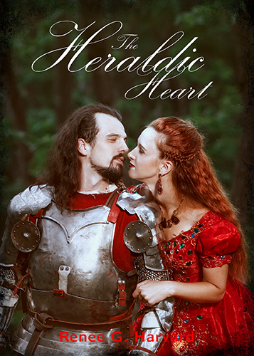 A curvy script text like this one will work well for a romance novel. |
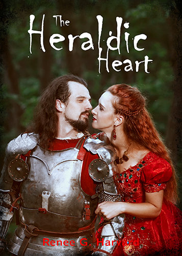 The same book with a horror font will make the novel look like a thriller and confuse readers. |
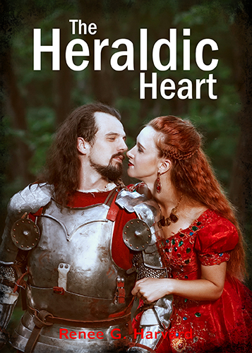 Using a formal font will make the novel look like a historical or informational text. |
