For your campaign to have an effect, your readers have to engage with it, understand it, and agree with it. But attention spans are short, and there are lots of other campaigns out there competing for your audience's eyes. The more time you put into writing good copy, the more impactful your ad will be. Copy is the written part of a design, and it's the key to communicating with your audience. How is copy used in this example?
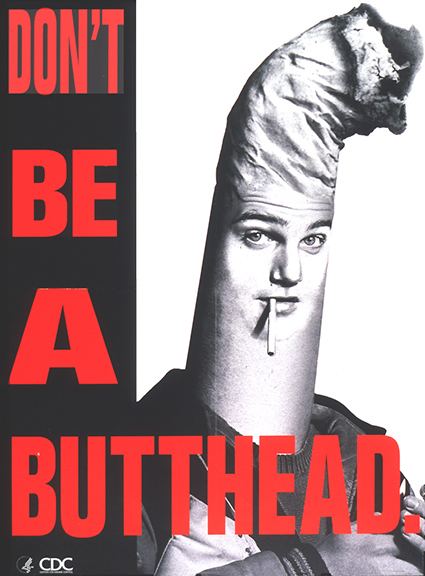
The CDC's use of copy here is simple, witty, and highly effective. There is no other text on the page, which lets the reader focus on the headline. The letters are bright and red, while the rest of the image is in black and white. Plus, seeing the word "butthead" coming from a government agency is shocking and amusing, further drawing the reader in. Finally, the pun on the word "butthead" drives the point home: smoking is not cool and glamorous like in the movies-- it makes you look like an idiot.
Study the use of copy in these examples.
|
Copy comes in all shapes and forms, but for this lesson, we're going to break it down into headlines, slogans, and calls to action. Headlines are what your eye sees first, and should get the most emphasis. Slogans help develop the main idea, and make the reader want to learn more. The call to action tells the reader what to do to help support the cause.
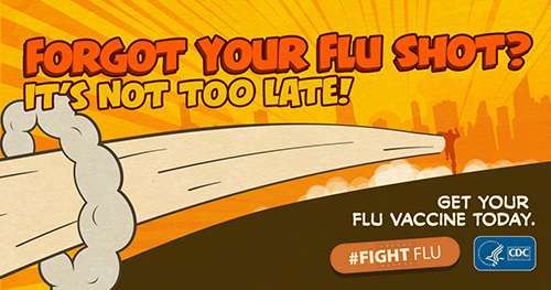
Sometimes you don't have a lot of time and space to relay a long, complicated message. That's when designs like this one, from the CDC's campaign to encourage flu shots, come in handy. The headline gets the reader's attention by asking a question, and the slogan, "It's not too late," ties in with the call to action: "Get your flu vaccine today.""
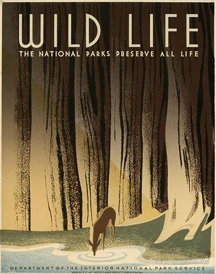
The headline and slogan for this piece are simple and elegant, and perfectly fit the style of the artwork and the intended message. The font is balanced and clean, and the repetition of the word "Life" further drives home the call to preserve nature. |
Do You Know?
Do I have to use copy in my graphic design?
Yes! To properly communicate with your audience, you have to inform them of your cause, why it matters, and what they can do about it. It's more or less impossible to do all that through images only.
