If you try just throwing together a photo and some text on a page without thinking first about where things should go, what do you think it might look like? If you said, "a confusing mess," you'd be right. Just like you can't randomly throw cake ingredients into an oven and expect to make something tasty, you can't just dump all your ideas on a page willy-nilly and expect them to make sense.
 |
| This layout doesn't use a grid, has boring fonts, and overall just seems slapped together. Your eye doesn't know where to go, leading to an ineffective overall design. |
On the other hand, there's no cookie-cutter recipe or template that will make a good design every time. The most eye-catching designs are provocative and new, and every graphic design job has a unique purpose and audience. If you try to force the elements of your design into a premade layout, it will look generic and out of place.
The best way to make great compositions is to learn the basic rules behind the art of layout and design. That way, you can build your own custom spreads from the ground up, knowing that they'll look great and communicate the message you want to send. Even in digital media, it's helpful to think of your image as a "page", and use grids, columns, and white space to organize and support your layouts.
Paper Size
Grids and Rulers
White Space
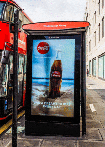
When starting a new layout, one of the first things you'll want to decide is the dimensions of your digital "page". Whether it's a tall and skinny, long and wide, or a perfect square, the proportion and resolution of your image should fit the purpose and audience of your campaign. If you're creating a poster for a bus stop ad, for example, your page will not only have to match the measurements of the frame, but will also need to have enough resolution to print in high quality later on.
However, if you're making a mockup for a webpage, you would use a standard screen size as a starting point, which has much lower resolution.

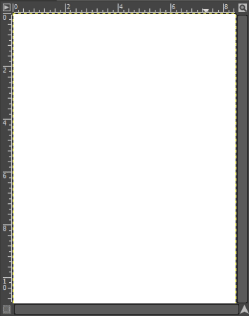
When this project is done, you may want to print out copies of your ad to promote your cause (or just to show off your skills). So we're going to work with a high resolution document from the start. Your ad should be about US letter size (either horizontal or vertical), and 300 pixels per inch.
If you're looking for a shortcut to good graphic design, starting with grids is about as close as you're going to get. A grid is like virtual graph paper that you can lay on top of your design, and is essential for aligning, arranging, and distributing your elements. Placing your photos, headlines, icons, and text along the grid ties your composition together and gives it solid visual structure. Notice how a grid underlays each of the following designs.

Pretty much every digital media program-- whether it's raster, vector, motion graphics, or whatever, has an option to show a grid. These programs also let you enable a ruler along the top and side of your document.
Use the ruler to segment your grids into equal pieces. For example, a standard US letter is 8.5 inches wide by 11 inches tall. We could make a grid of 1" squares, divided into quarters. And we know that the horizontal center of our document will be at 4 and ¼ inches. The vertical center will be at half of 11 inches, or 5.5 inches.
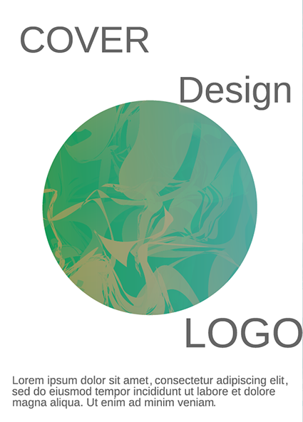
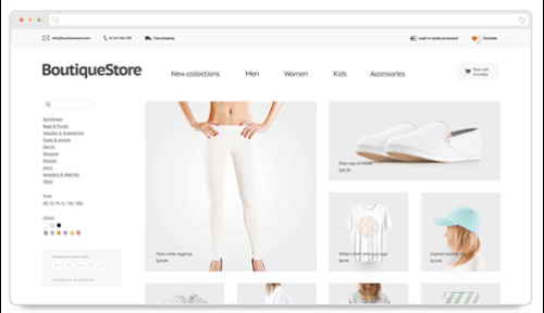
A time tested cure for a design that's just not working is to add more white space. White space refers to the empty parts of your page-- the areas where there are no design elements. This is also known as negative space. Using white space gives each design element room to breathe, removes clutter, and helps organize information. Check out the use of white space in the example below. The margins (boundary around the page), columns (vertical divisions of text and images) and negative space (areas around menu items and logos) make this design feel light, clean, and accessible.
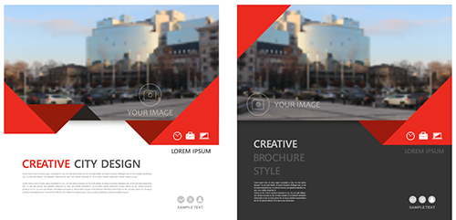
White space doesn't have to be white. If your design has a background color or texture, it can still count as white space as long as it doesn't compete with the design elements. For example, the space around the headline and copy in these two mockups would still count as white space, even though the one on the right has a solid charcoal background.