One factor that makes direct measures of population size difficult is that populations are dynamic. In other words, they are constantly changing. Individuals die; new individuals are born. Not only do deaths and births affect population size, they also affect other aspects of populations that are relevant, such as how that population evolves and how its individuals behave. For example, if you unknowingly chose to study a population of mammals that are past reproductive age, you might mistakenly conclude that this species has bizarrely secretive mating habits or that they were organized into a social hierarchy in which only an extreme minority of the population was permitted to breed, when in fact you are simply studying very old animals.
Thus, it is helpful to know another characteristic of the population: the age distribution. The age distribution of a population is how many individuals there are of each age. We can compare the age distributions of different groups of animals to understand more about each population. For example, one population of a species may have many young animals, while another population of the same species has mostly old animals. We can make some predictions based on these differences. We would expect the younger population to produce offspring but not the older population. We would expect individuals in the older population to die before those in the younger population. Age distribution is often presented as a graph like this one.
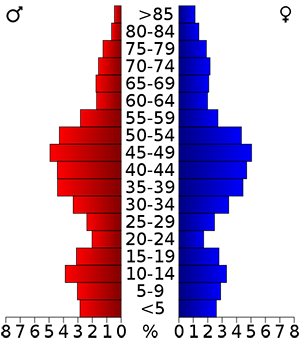 This graph shows the age distribution of humans in a county in Massachusetts according to 2000 census data. To create this graph, age was split up into ranges (y-axis). The number of individuals in the population in each range were counted and are displayed as percentages (x-axis). This allows us to compare the percentage of people in different age brackets. Males are shown on the left in red and females are on the right in blue. This allows us to compare the age distribution of males vs. females. For example, within males (red on left), we can see that there are more 15-19 year old males than 20-24 year old males. Between sexes, we can see that there is a higher percentage of males from 20 to 24 than females.
Do you understand what an age distribution tells us? Answer the following questions to test your understanding.
Is there a higher percentage of males or females above 85 years old?
- males
- females
- approximately the same
- cannot tell from the graph
In the >85 age bracket, the blue bar (females) is larger than the red bar (males).
In the >85 age bracket, the blue bar (females) is larger than the red bar (males).
In the >85 age bracket, the blue bar (females) is larger than the red bar (males).
In the >85 age bracket, the blue bar (females) is larger than the red bar (males).
In the age distribution above, how do the percentages of males and females in their 60s compare?
- many more males than females in their 60s
- many more females than males in their 60s
- approximately the same amount
- cannot tell from the graph
In this age bracket, the blue bar (females) is about the same length as the red bar (males).
In this age bracket, the blue bar (females) is about the same length as the red bar (males).
In this age bracket, the blue bar (females) is about the same length as the red bar (males).
In this age bracket, the blue bar (females) is about the same length as the red bar (males).
Summary
 Questions answered correctly:
 Questions answered incorrectly:
