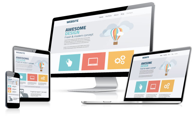
The new era of web design incorporates responsive web design—a form of design that adjusts depending on how a website is being accessed. A large portion of responsiveness in a design is handled by percentages and media queries. And with media queries specifically, even if you know how to use them, what do you do with them? They allow you to adjust just about any CSS styling that a page can use. So what's worth your time focusing on?
We need to ask ourselves a few questions to find out what we need to do. First, "Why did responsive web design come about in the first place?" It started (at least in part) because browsers are used through so many different devices today. "What challenge does this pose?" Our designs need to accommodate different proportions and view spaces available. "What page elements and aspects of CSS affect that?" And this last question is the question we will be focusing on.
When creating a design that is responsive, it is strongly recommended to set the base design with smartphone displays in mind. Since they are typically the least powerful in terms of processing power, we want them to also need to work the least. If the responsive styling is saved for the more powerful devices, those devices will apply the changes with relative ease.
As we move from device to device, we will need to save space, fully utilize space, or redistribute content. So we'll be working largely with dimensions, box model properties (margin, padding, border), and display properties. These are the types of techniques we'll explore throughout the lesson to help you build a web page that is laid out gracefully, regardless of its viewing platform.
