Plotting Change
How are graphs used in informational text?
Goal:
Goal:
Graphs like the one below are used to provide a detailed picture of changes that occur over time. The chart on the previous page compared the temperatures of jars in different locations on various days. The graph below shows the average temperature change in both jars over time.
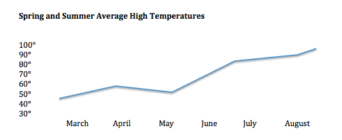
In this graph, temperature is marked on the left, and time is shown on the bottom of the graphic. The line shows how the temperature rose or fell during a specific amount of time.
Question
During which month did the average temperature in the jars increase the most?
June